Design
Strivr
-
Strivr is a leader in virtual reality training, founded by a coach at Stanford University. Originally known for helping professional athletes train on and off the field, Strivr expanded into the enterprise space after securing contracts with the NFL and Walmart. Today, Strivr gives enterprise teams the power to elevate frontline performance at scale through immersive learning and AI-powered guidance, revolutionizing the way organizations train their employees.
-
Sole designer on the team behind Strivr's brand refresh, responsible for the visual repositioning of the company for a new enterprise audience. Worked closely with the creative director to develop design solutions that reflected Strivr's evolution from sports performance training to a broader corporate learning platform.
Logo
The logo retained its core structure and recognition, the update was about refinement, not replacement. Tighter geometry, cleaner execution, same DNA.
Iconography
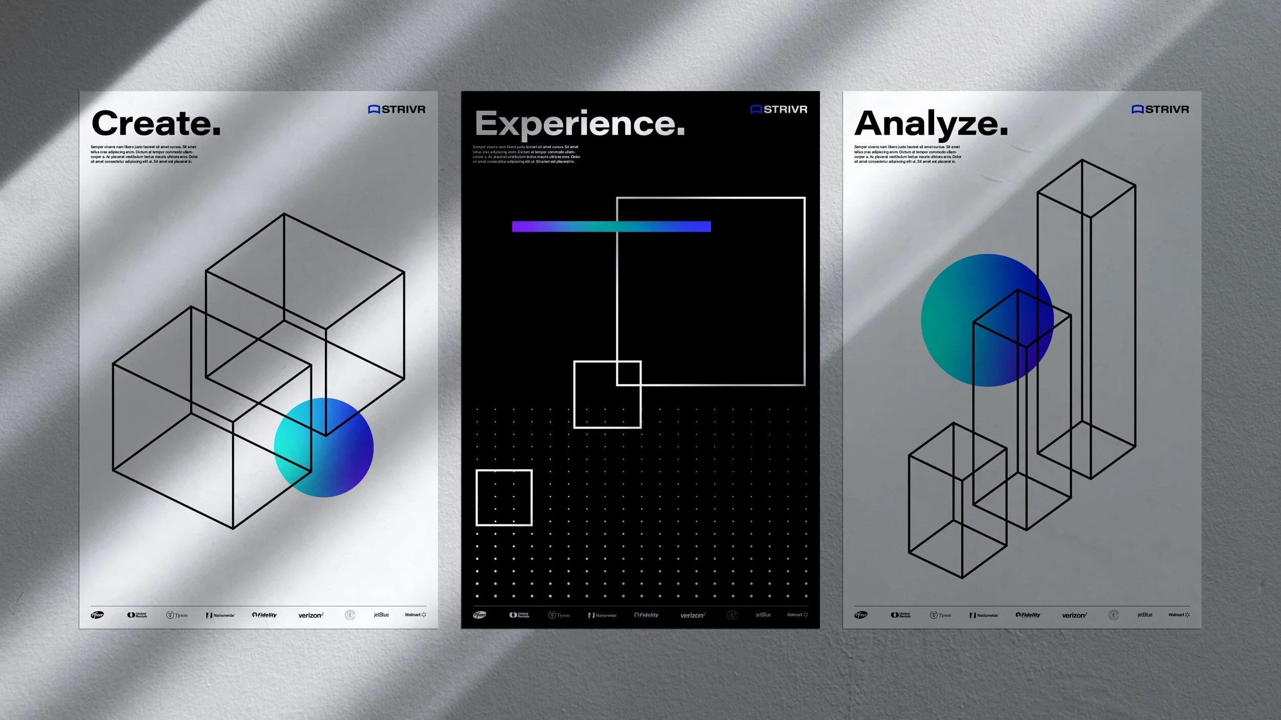
A suite of isometric icons was designed to represent each stage of Strivr's training process. The isometric style reinforced a sense of dimensionality, tying back to the broader visual language while maintaining a clean, enterprise-ready aesthetic.

Pattern exploration
To reflect Strivr's roots in virtual reality, I explored geometric patterns that evoke depth and three-dimensional space. Using spirals, radiating lines, and perspective-driven grids, the goal was to capture the immersive feeling of stepping into a virtual environment while keeping the aesthetic technical and precise.


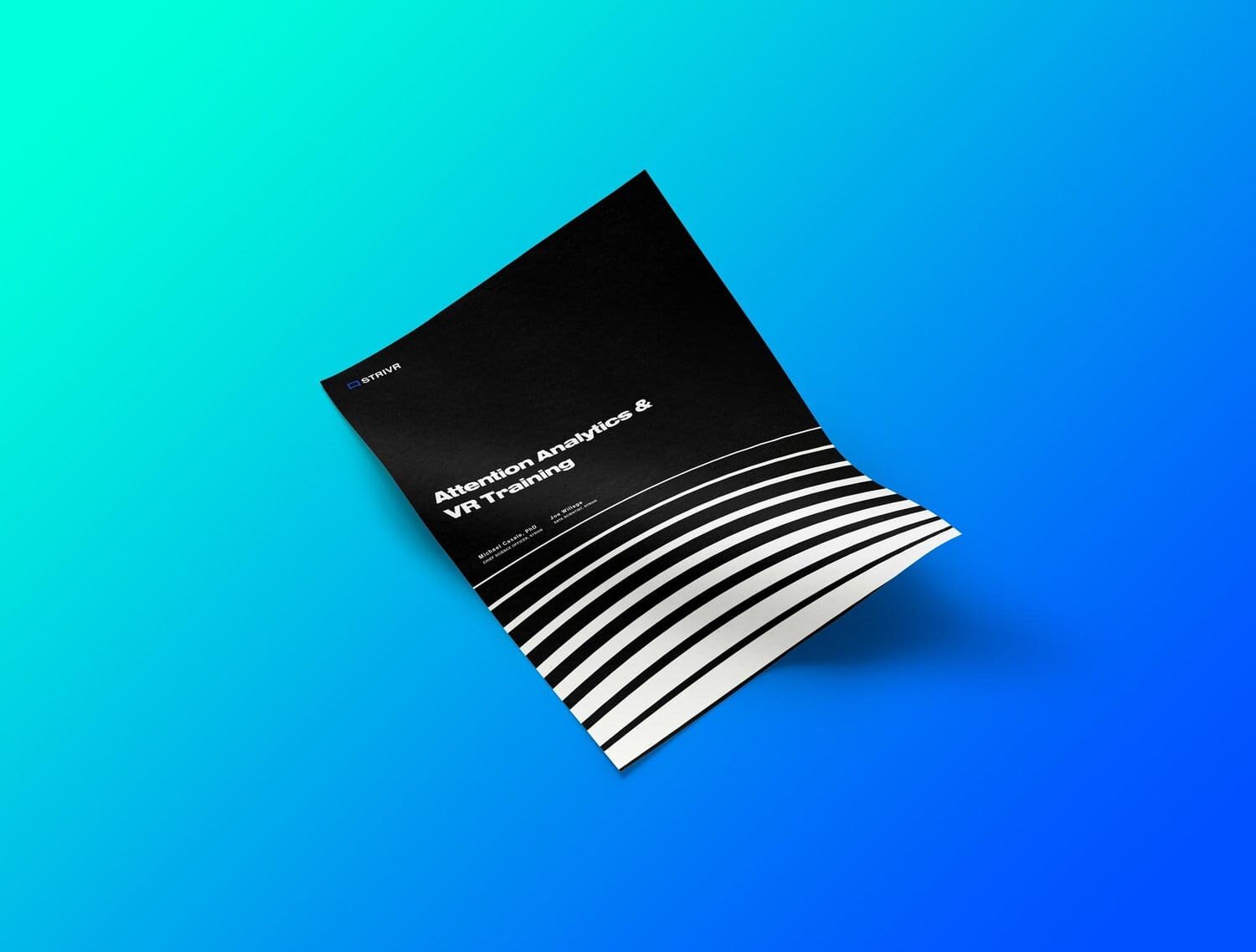
When undertaking a brand refresh, it's essential to see how the visual system holds up across a variety of touch points to ensure consistency and longevity. Throughout the Strivr project, I explored how the updated brand could translate across physical products, printed collateral, and digital platforms, making sure the identity felt cohesive no matter where it showed up.