Creative Direction, Art Direction, Strategy
Facebook Illustration System: Caleo
-
Evolution over revolution. This project was about maturing the Facebook illustration system, taking a proven foundation and expanding it into a more flexible, high-energy visual language. By tightening the craft and diversifying the style, the goal was to ensure the brand feels both relevant to the moment and unique to the platform.
The result is Caleo (Kah-Lay-O), a distinctive 2D illustration style derived from the Latin verb calēre, meaning "to be warm," "to glow," or "to heal." Caleo uses lighting and materiality to create a simple, balanced, and scalable system built to enhance the user experience across Facebook.
-
Owned the end-to-end creative direction for Caleo, from establishing the visual language and material philosophy to final execution across 100+ illustrations.
Defined the aesthetic framework that guided a cross-functional team through two phases of development, using early UXR testing to sharpen direction before delivery.
Built alignment with brand and foundation leadership up to the Head of Design for Facebook, and co-led the creation of a comprehensive toolkit and guidelines that gave designers and illustrators everything they needed to extend Caleo independently across the product.
Evolution
The refresh was about refinement, not reinvention. Silhouettes were streamlined, forms made sleeker. A matte, ceramic-like material replaced shinier surfaces. The goal was sophistication that felt effortless rather than polished.
Color decisions were intentional down to the specific value. A single blue anchor kept illustrations vibrant and distinctly Facebook rather than drifting toward pastels. Tertiary bounce light colors were pulled from the Reactions system, creating subtle cohesion across two visual languages that needed to coexist.


After
Before




Comprehensive styleguide
With the visual language defined, the next challenge was making it teachable. Working with a team of three, the system was codified into a comprehensive style guide, a living reference covering everything from material and texture application to color rules, form principles, and lighting behavior.
The guide was written to be instructive rather than prescriptive: grounded enough to maintain cohesion, flexible enough to support creative judgment. The goal was that anyone coming into the work could understand not just the what, but the why behind every decision.

AI tooling
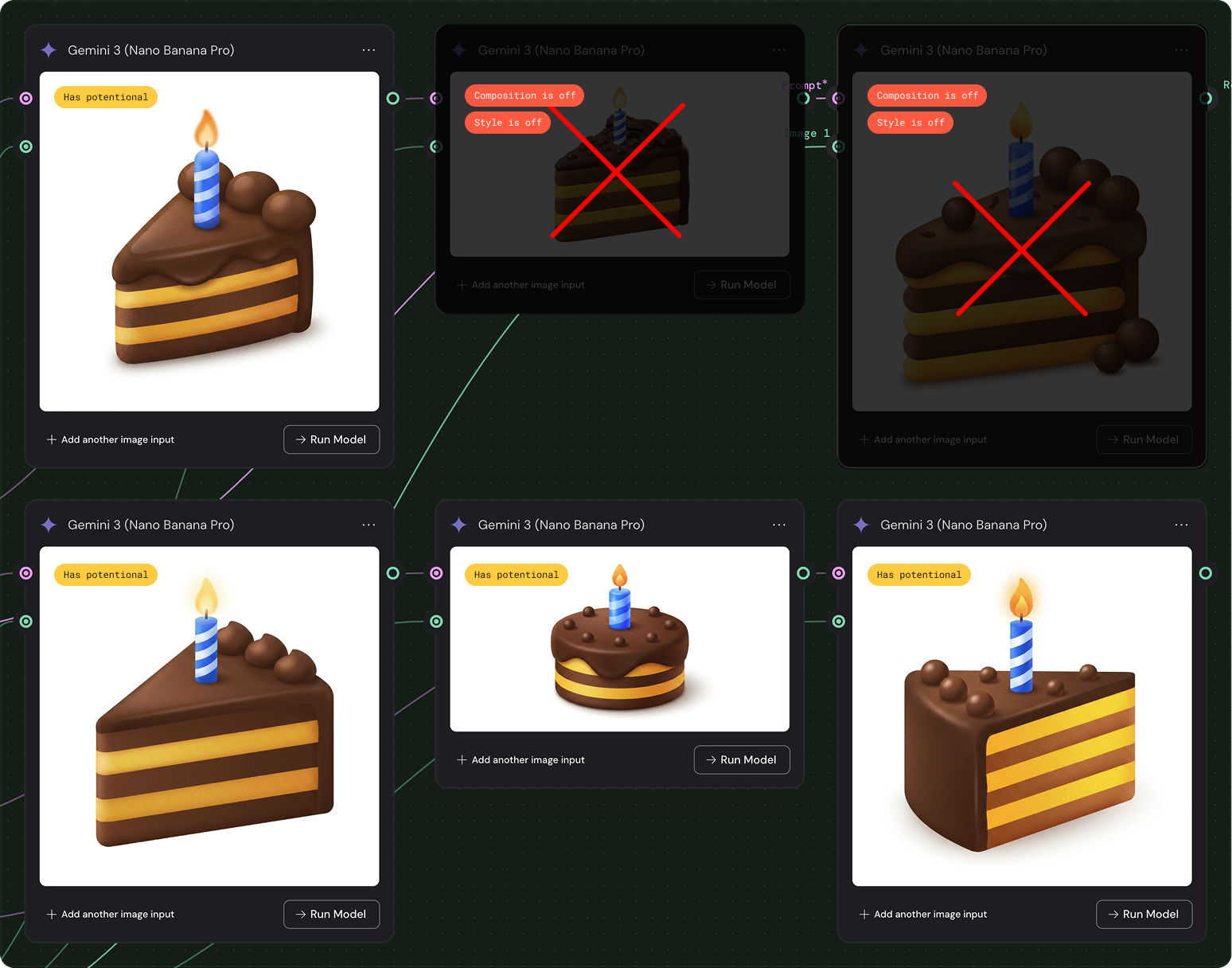
Built on the foundation of Caleo's visual language, the next challenge was making the system generative. Co-leading a team of four, the work involved developing an AI pipeline using Figma Weave that could produce on-brand illustrations on demand, supporting idea exploration and cutting production time without sacrificing the craft standards the system was built on. The tool shipped as a Figma plugin, living right where designers worked.
We defined the style. Then we taught a machine to speak it.
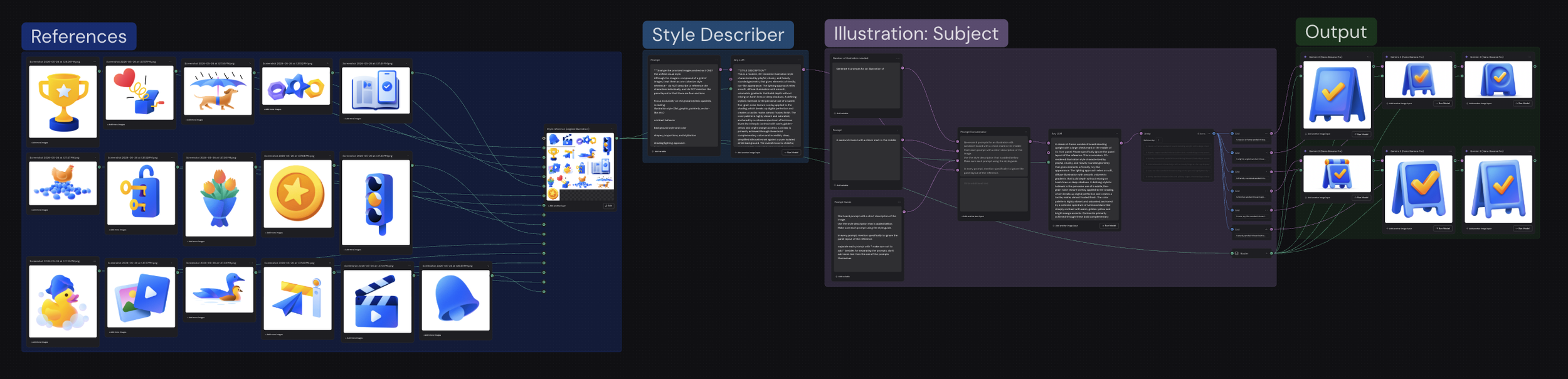
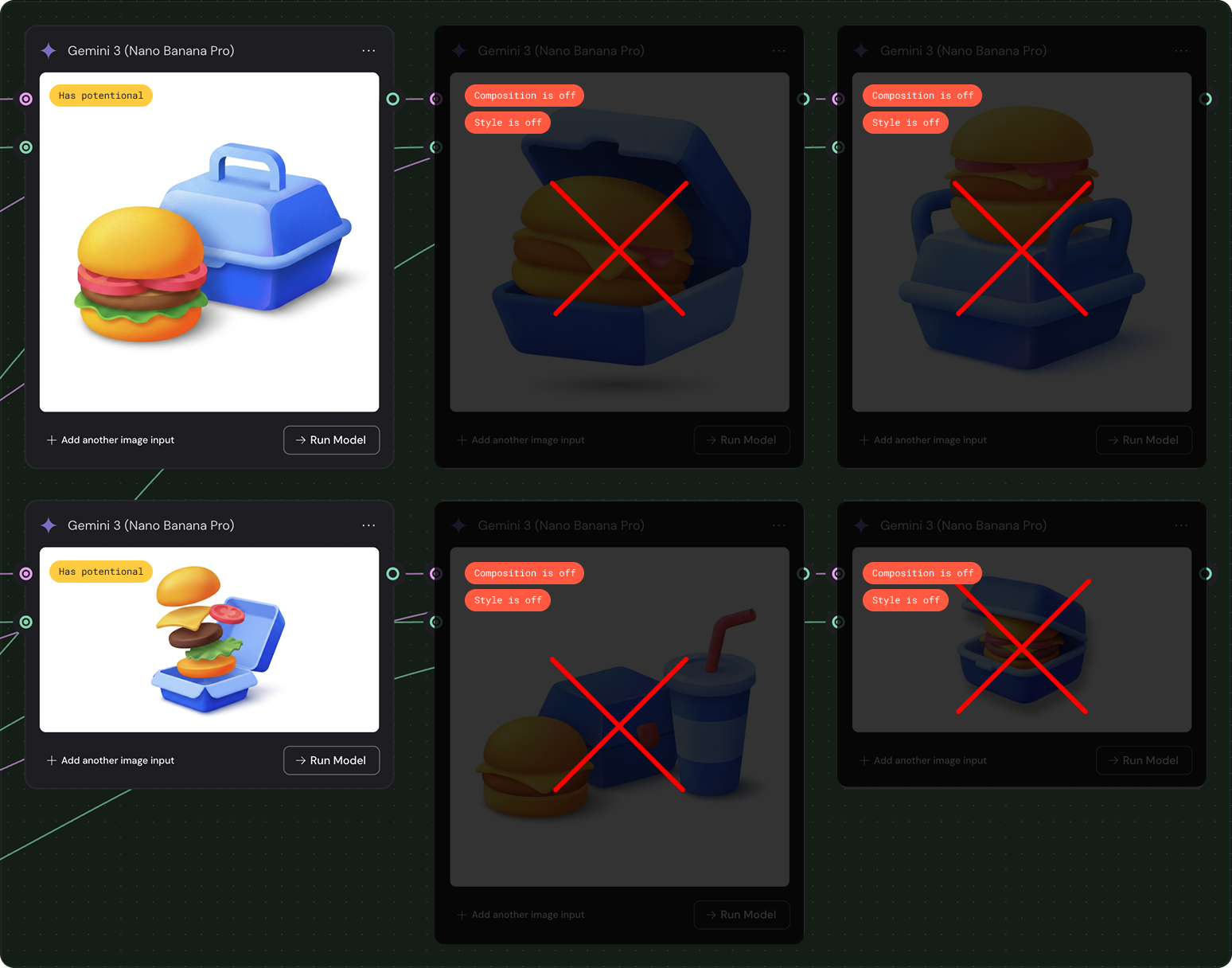
But generation was only part of the process. Once Figma Weave produced its output, the real work began: reviewing, selecting, and deciding what actually worked. Not every generated illustration had the right feel, the right weight, or the right personality. That's where taste came in. Knowing which one to keep, which to discard, and why, that judgment is what separates a system from a craft.
Final outputs aren't available to share due to confidentiality.