Honda Research America
-
Honda Research America is the research and innovation arm of Honda, focused on advancing technologies that shape the future of mobility. This project was a speculative identity system pitch exploring how HRA could visually differentiate itself from Honda’s consumer brand, positioning the institute as a forward-thinking technology organization at the forefront of AI, robotics, and autonomous systems research.
-
Working with 2 other designers, we created a bold, black and white colored identity system with a logo that was inspired by imprints, tire tracks, and footprints. It showcases the dynamic movement, progressive attitude, and the agile velocity that Honda Research America represents.
The final deliverables included logo design and mark exploration, typography selection, color system, and a comprehensive set of brand guidelines. Every decision was made with the intent of building a system that could scale across digital platforms, research publications, and physical environments, communicating innovation with clarity and authority.
Design
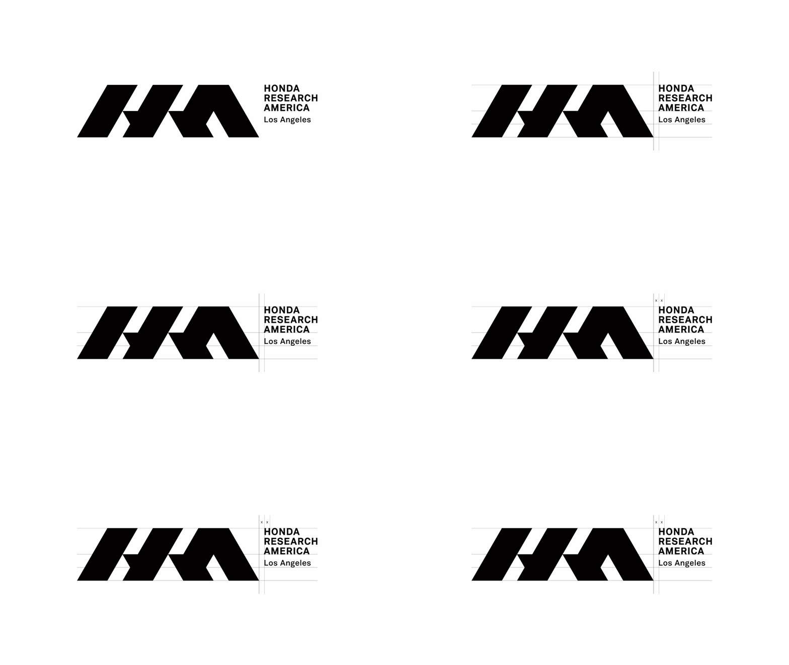
Logo
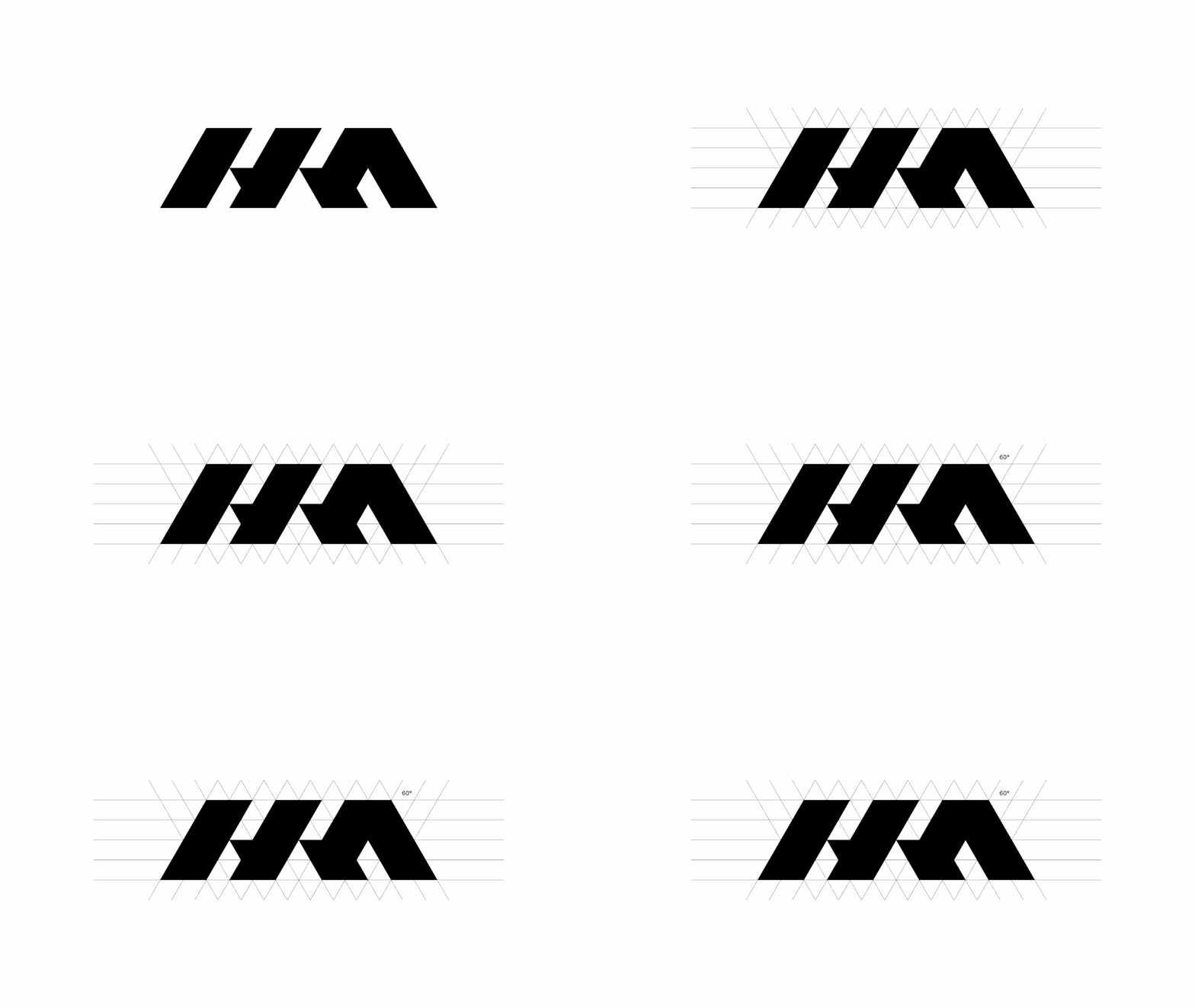
The logomark is derived from the notion of leaving imprints, the footprint of explorers, the trekmarks of tires, the legacy of pioneers. It speaks to the idea that HRI-US has already been somewhere you haven't, and the mark they leave behind is one worth following. Like a footprint in the snow, it signals trust, direction, and the promise of discovery ahead.
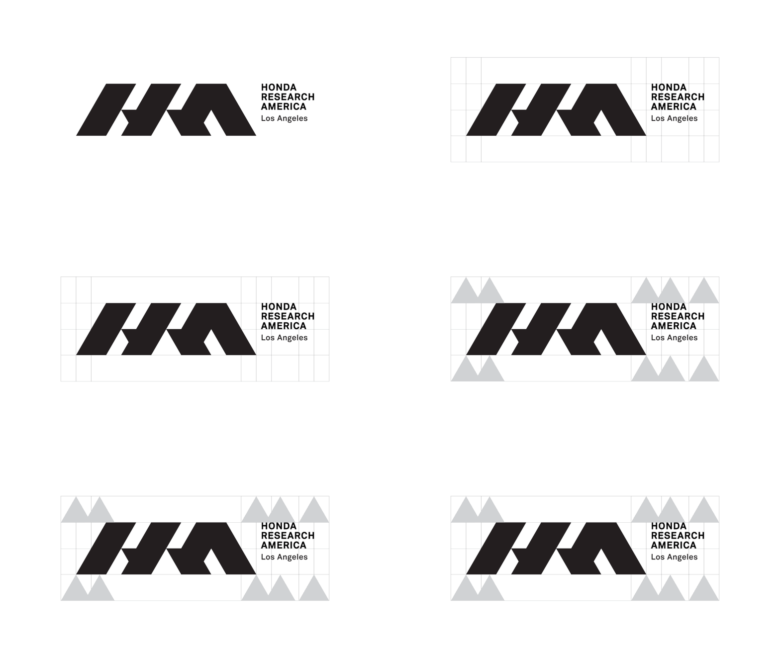
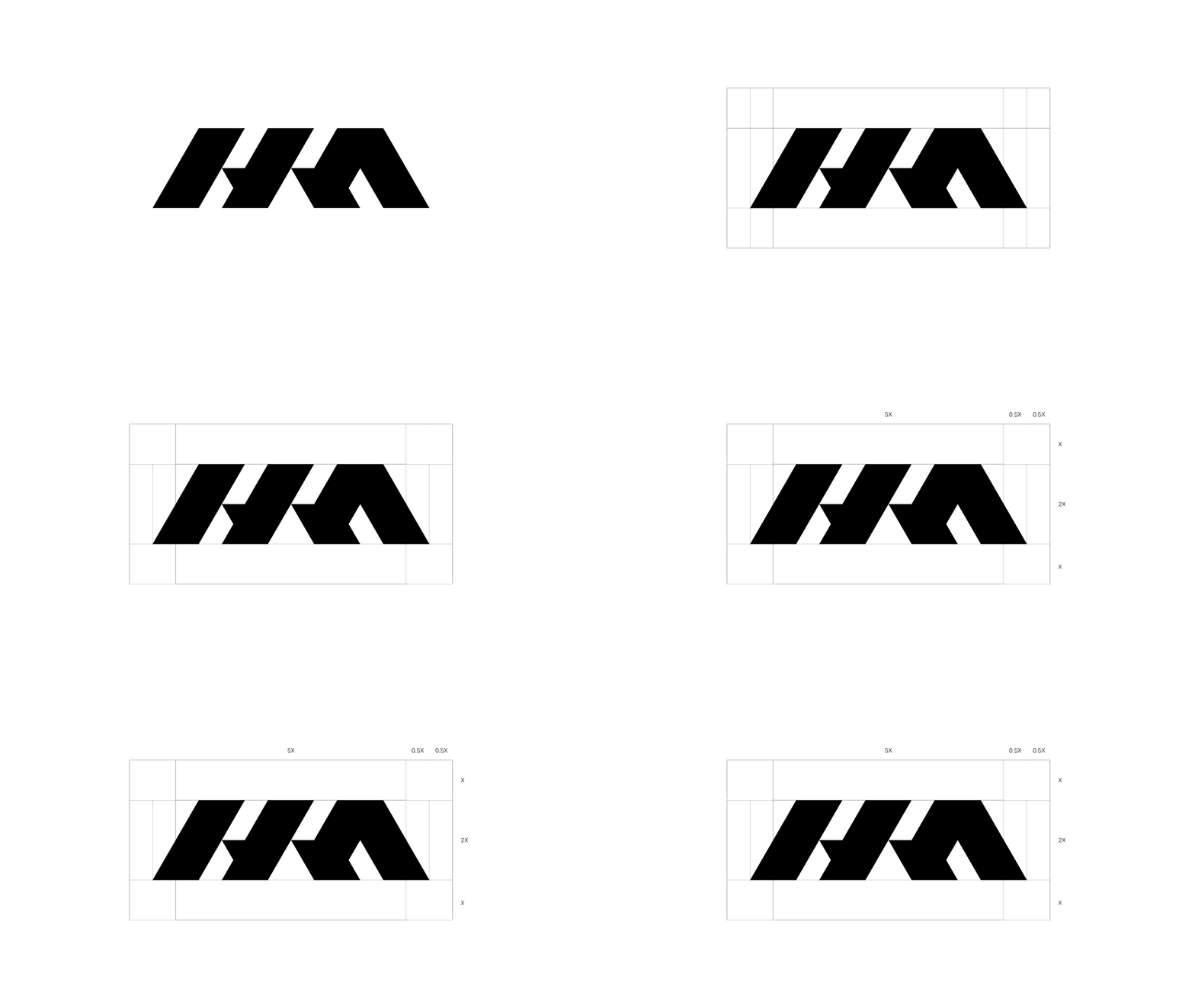
This logotype is the most important visual element of HRA’s identity system and should be used consistently and repetitively throughout different media platforms.
Tagline
The tagline operates on two levels simultaneously. As a question, it provokes curiosity, asking the viewer to imagine what comes next, what possibilities the future holds. As a statement, it answers with quiet confidence: HRA isn't chasing the future. They are the future.

Typography
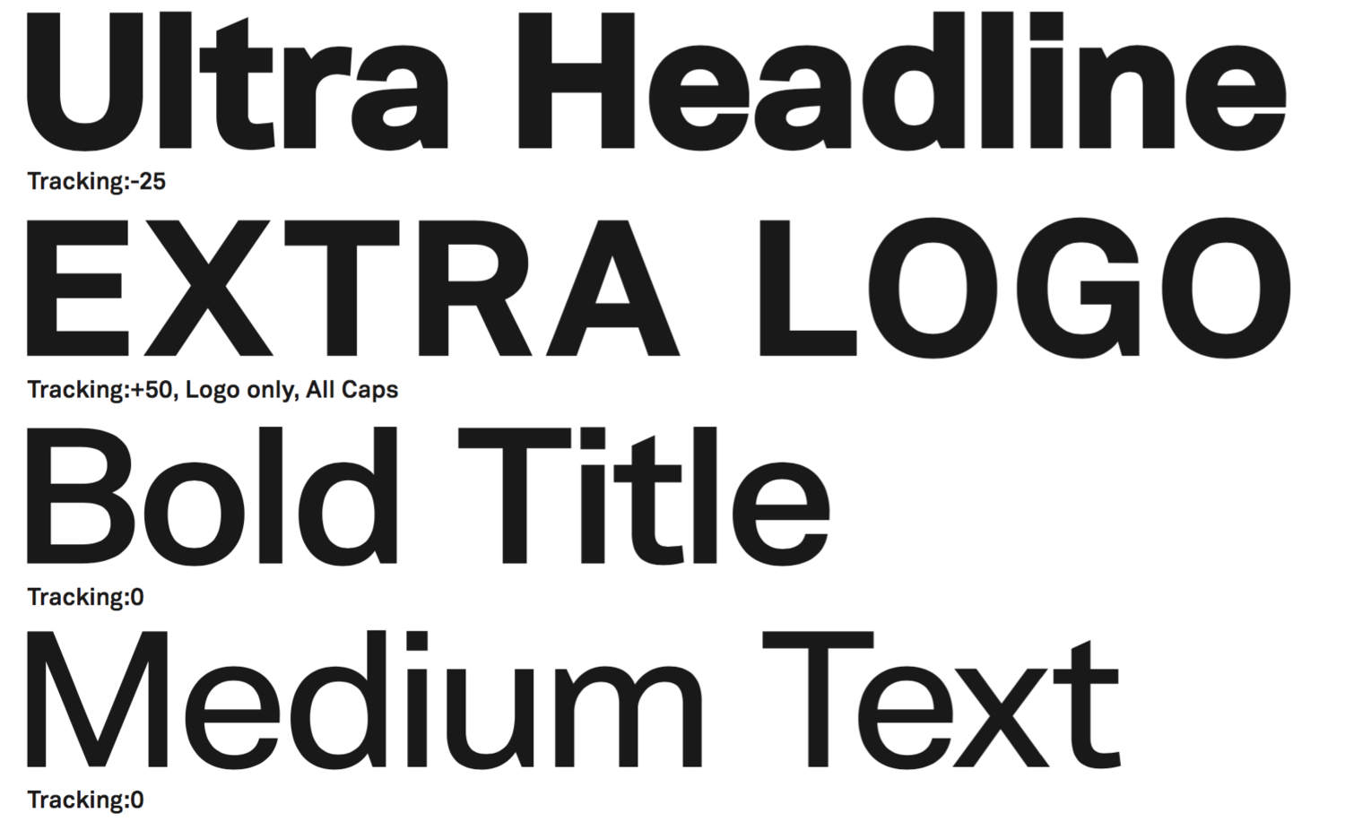
Vaud is the typeface chosen for this visual identity. The letterform retains sharp edges and corners, but at the same time, full in its body. With tapered details, it is the best companion to the bold HRA logotype.

Graphic Element
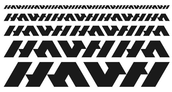
The logotype is set in a staggered sequence, echoing the rhythm of tire imprints left in motion. It stands as the most versatile element of the brand, capable of carrying the identity on its own, without the mark.

Collateral
It's essential to see how the visual system holds up across a variety of touch points to ensure consistency and longevity.


Other projects:
Art Direction, Strategy
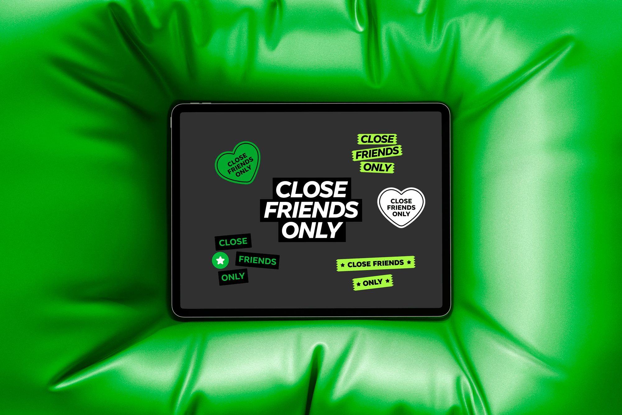
Facebook Close Friends

Design
Strivr
Design
Anime Expo
Design
Logotype Collection
Design
Logomark Collection