Design
Anime Expo
-
Anime Expo is the biggest anime convention in North America. With hundreds of thousands in attendance each year, Anime Expo brings together passionate communities to celebrate the cultures they love most.
-
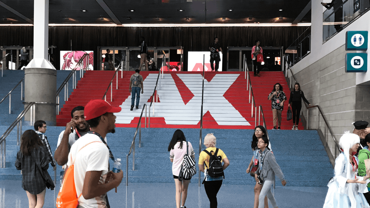
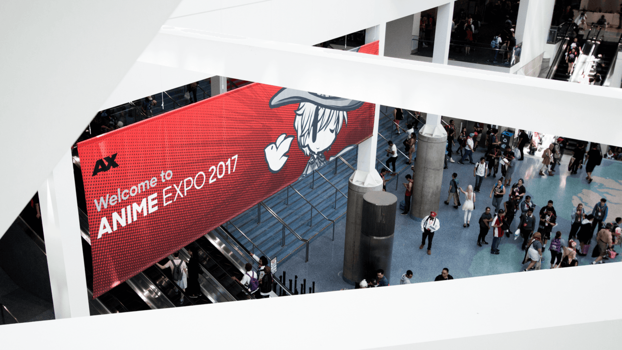
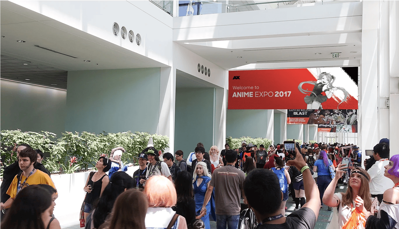
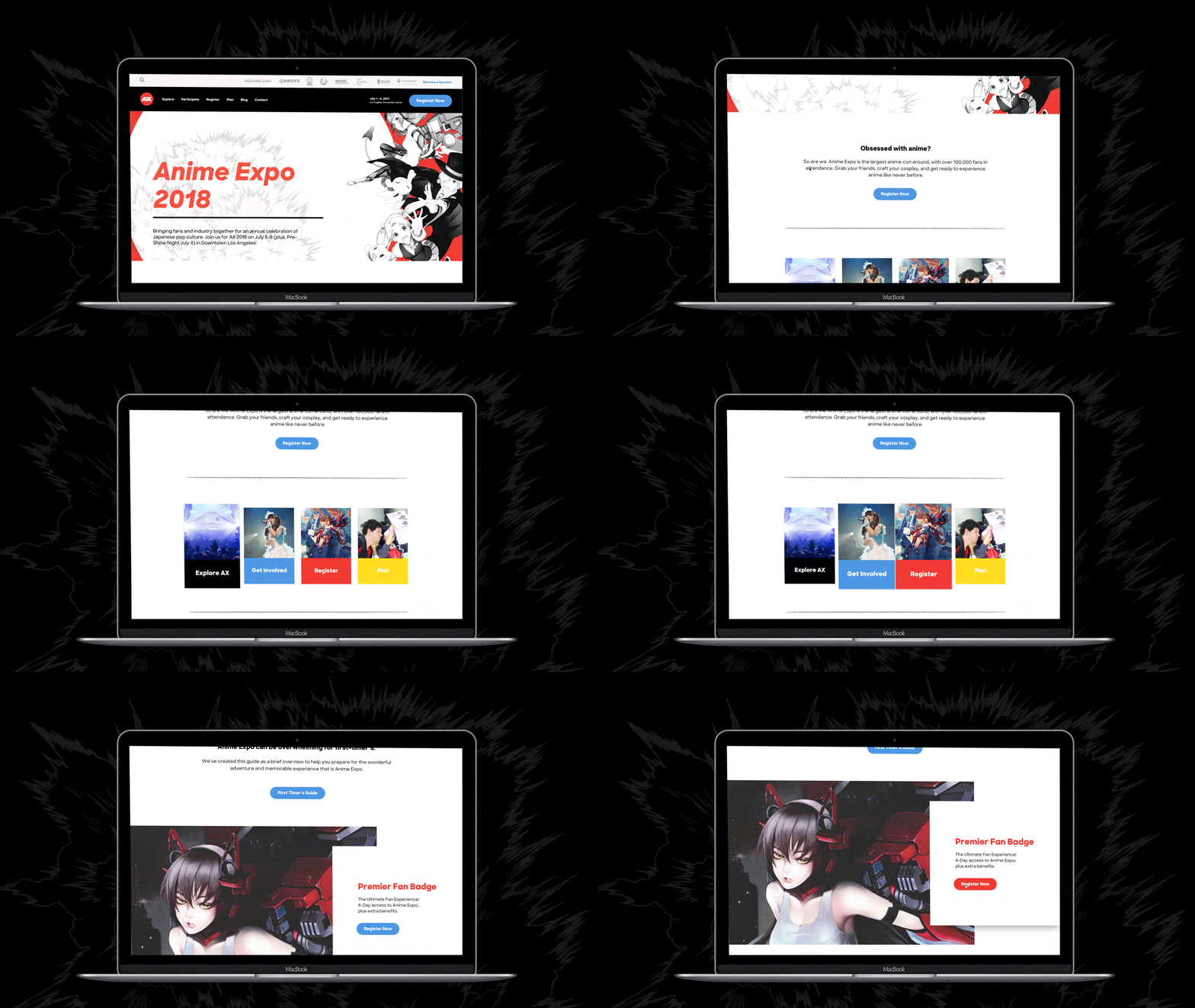
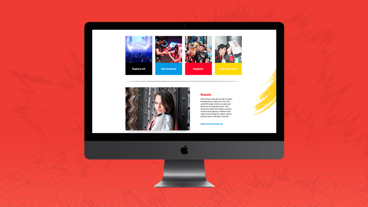
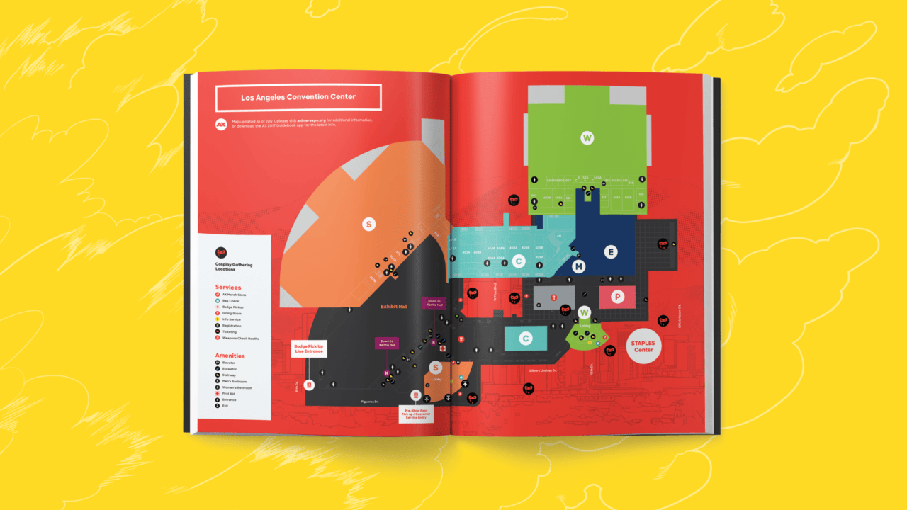
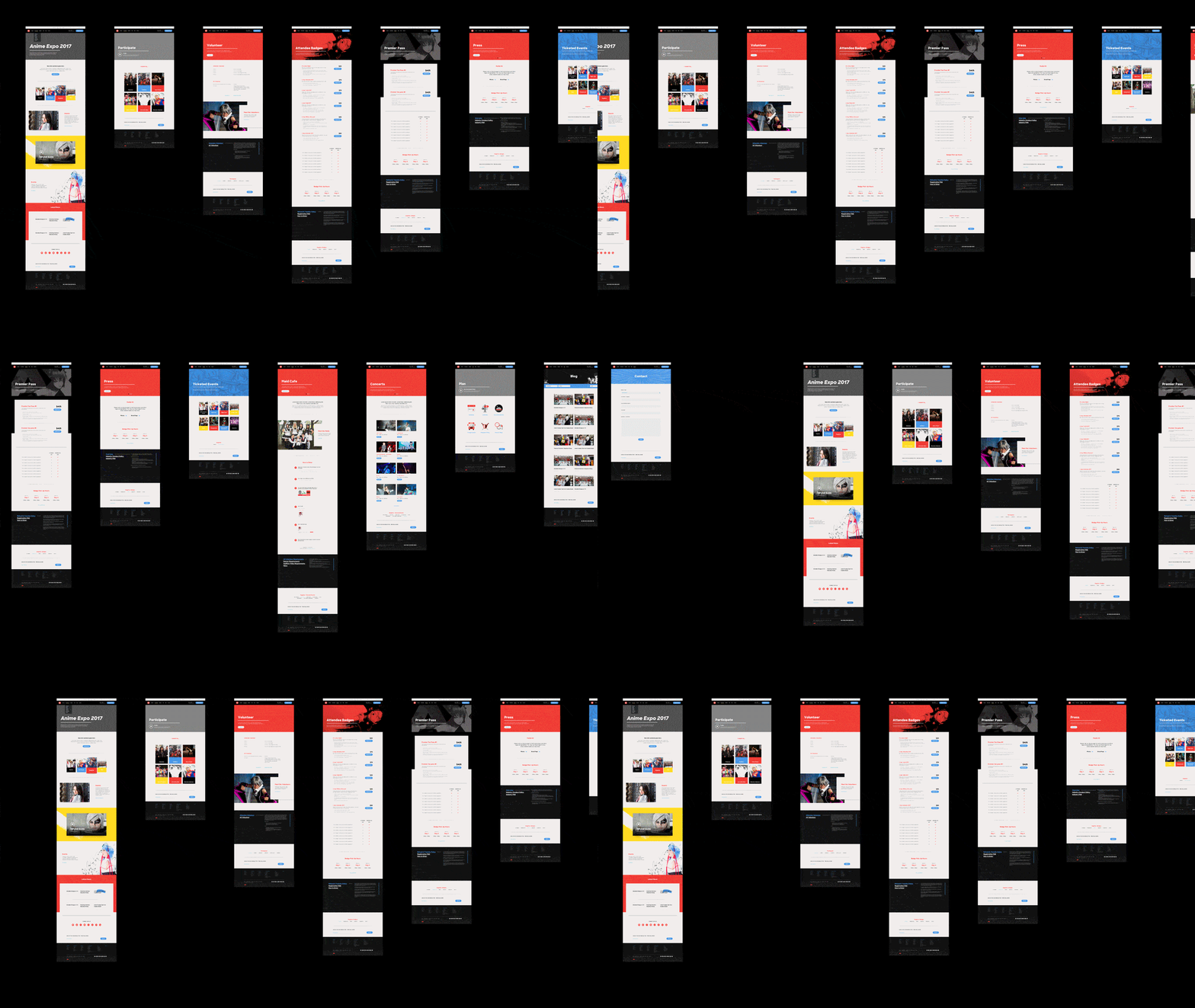
As a designer at Blind, we partnered with Anime Expo to help rebrand their annual event. The process began with crafting the brand strategy, positioning statement, and user profiles. From that, we developed a complete identity system that reached every touchpoint of the event.
Logo
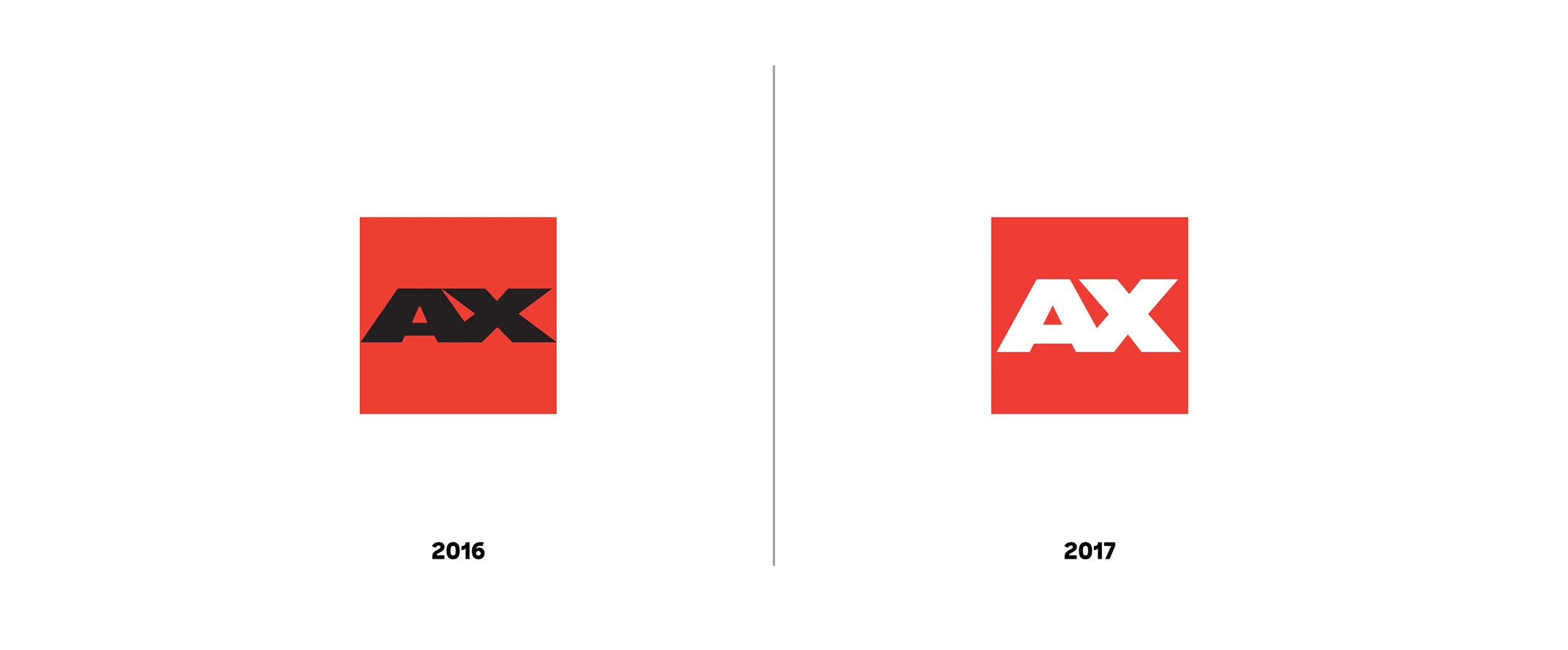
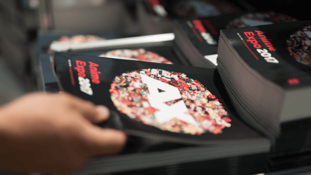
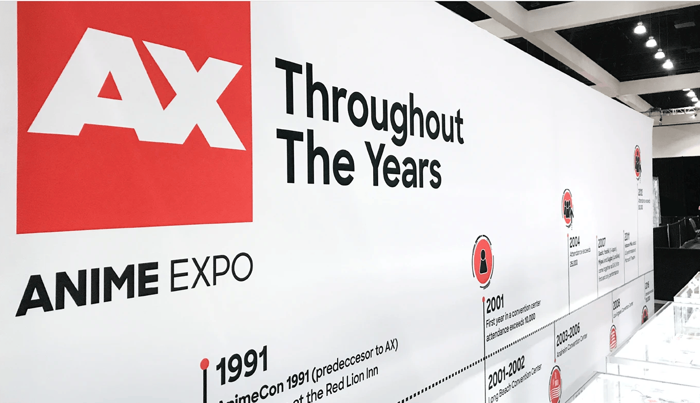
The long-standing event has built up years of brand recognition into their logo. We took what was working well with the previous logo and refined its form to work on a broader scale of applications and sizes.
Typography
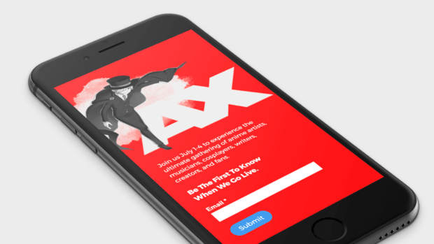
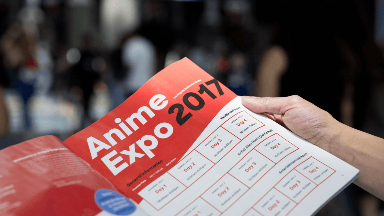
We updated the typeface of the brand to be more modern and clean, with just enough character. A typeface flexible enough to work well across large printed displays down to small digital screens
Brand colors
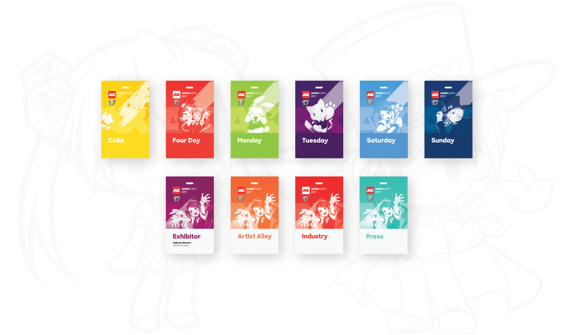
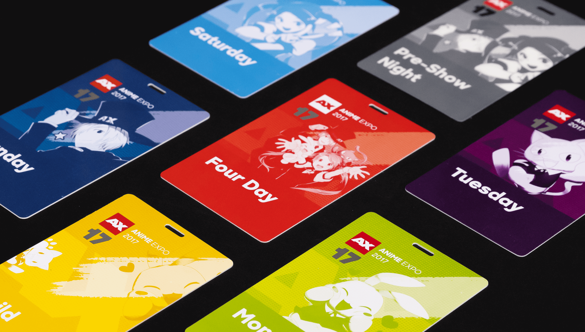
Bold, diverse and fun. The Anime Expo brand colors are a reflection of its dynamic community. It’s also used to color code and organize various design systems across the brand.
A visual system inspired by artists
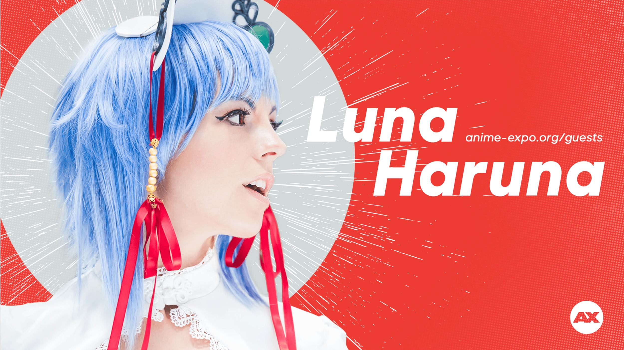
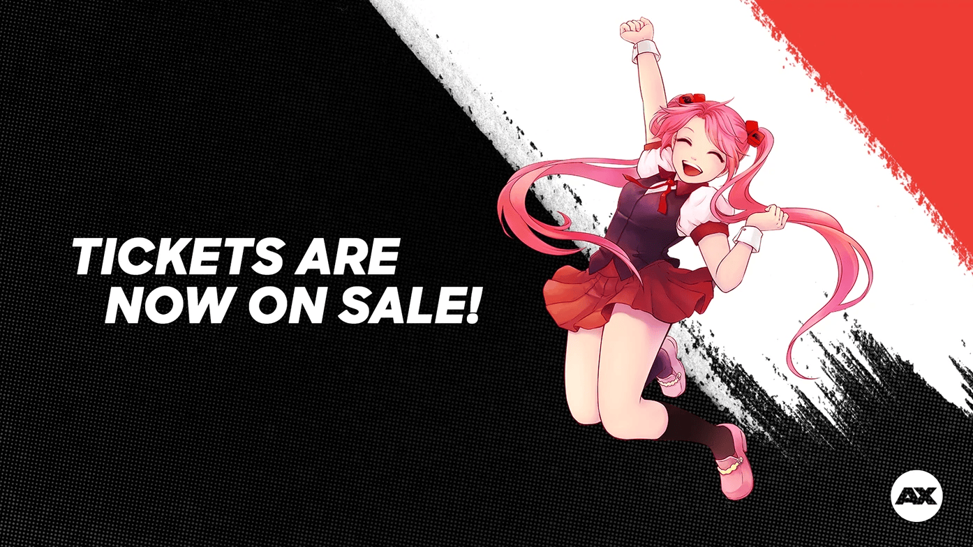
The aesthetic of the brand was inspired by the art behind the culture. pencil strokes, halftone patterns, fluid ink washes and dynamic compositions became the visual system we implemented across the brand.
The ultimate fan experience
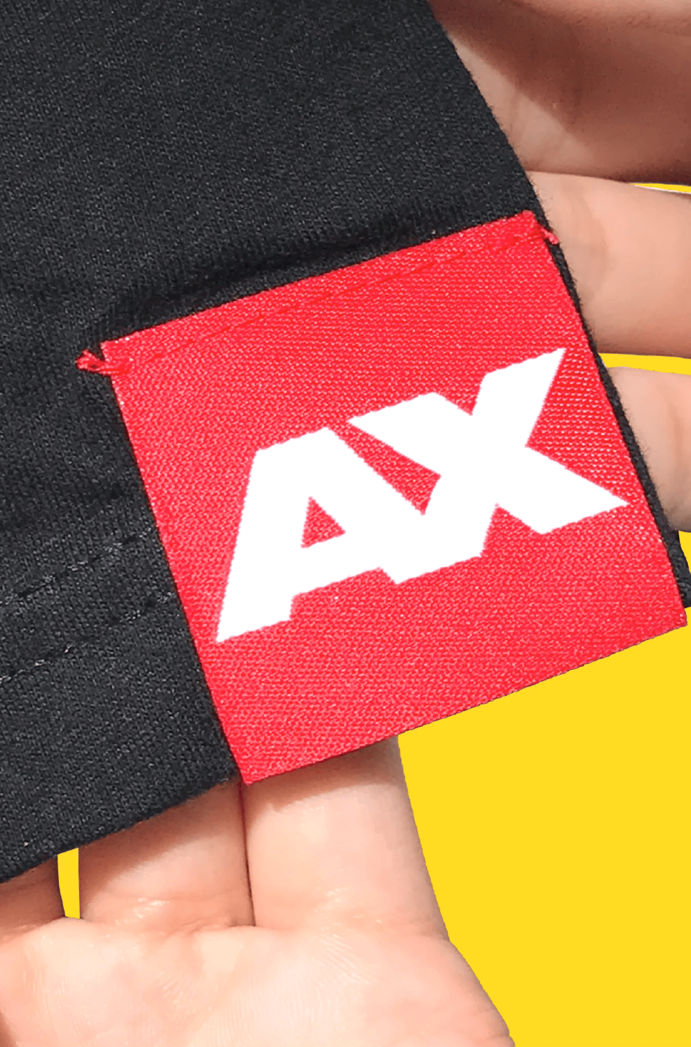
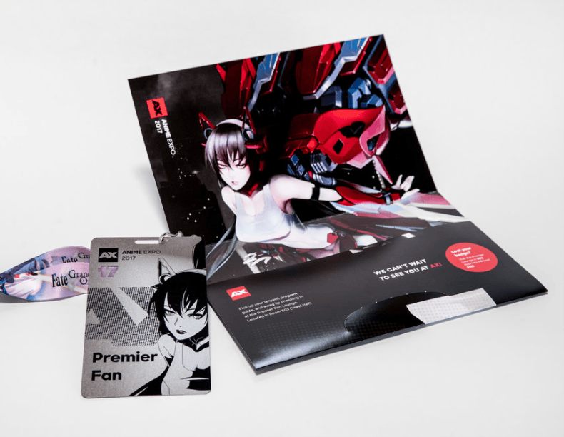
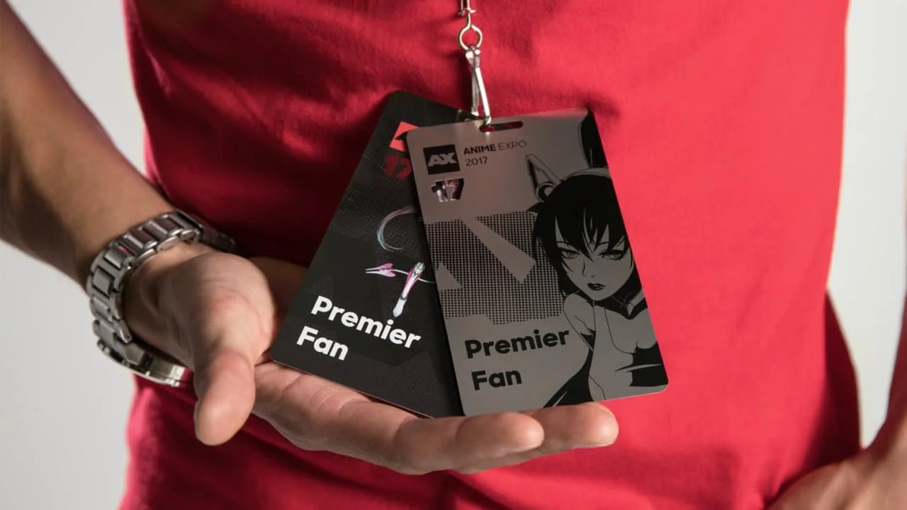
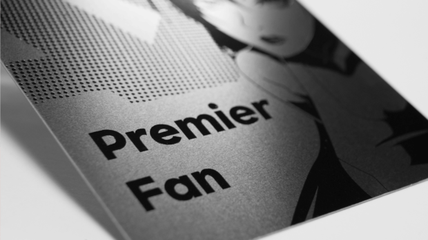
Beginning with the package they receive in the mail, we designed a premium experience for top tier event goers. Including a custom mailer, event badge, and collectible metal badge.
Other projects:
Art Direction, Strategy
Facebook Close Friends

Design
Strivr

Design
Honda Research America
Design
Logotype Collection
Design
Logomark Collection