Art Direction, Design
Messenger Iconography System
-
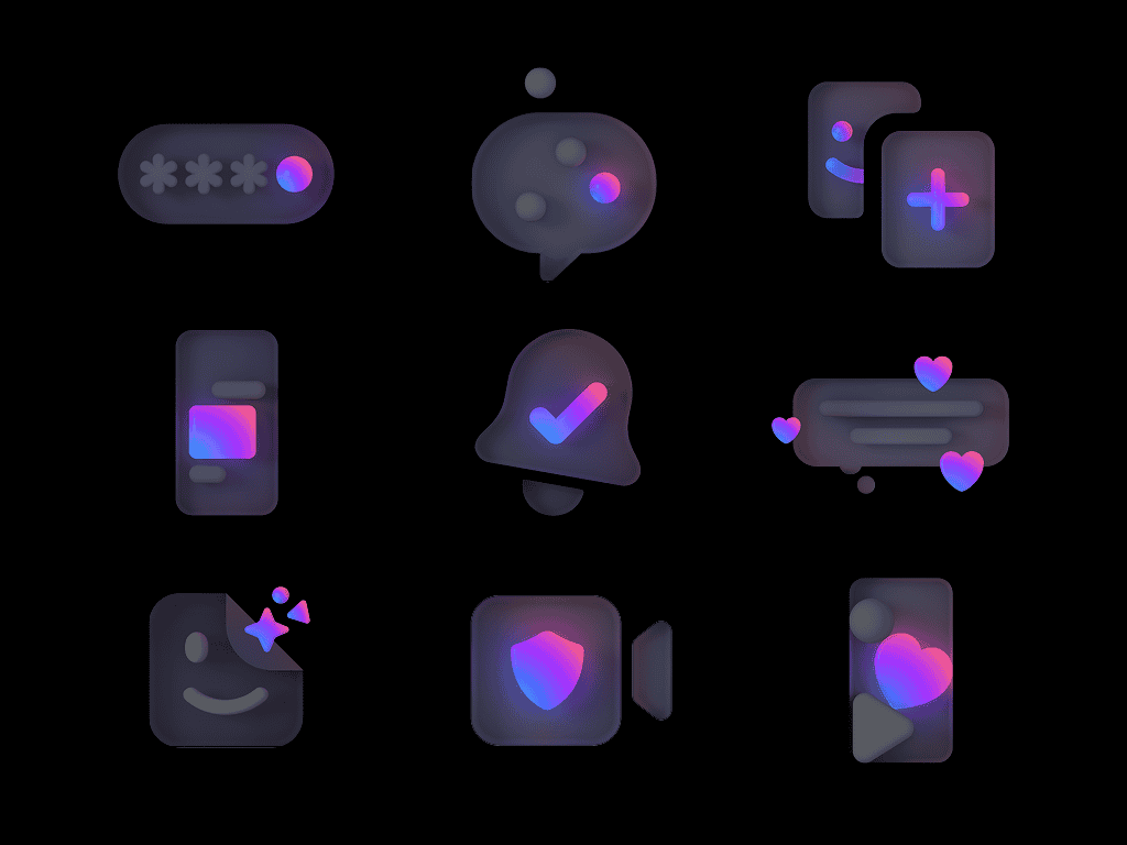
Icons are the smallest units of a design language, but they carry outsized weight. The Messenger Iconography System defines how iconography looks, feels, and functions across the product. Built to set a high bar for craft and keep every icon feeling like it belongs to the same visual world, the system gave the team a foundation to create consistently at scale.
-
Owned the Messenger Iconography System end to end. What began as hands-on design work evolved into full art direction and creative ownership, absorbing a contractor's workload and becoming the primary voice on quality across the system. Responsibilities include defining the craft standards, reviewing production output, and ensuring every icon that ships meets the visual and functional bar set for the product.
Messenger Iconography
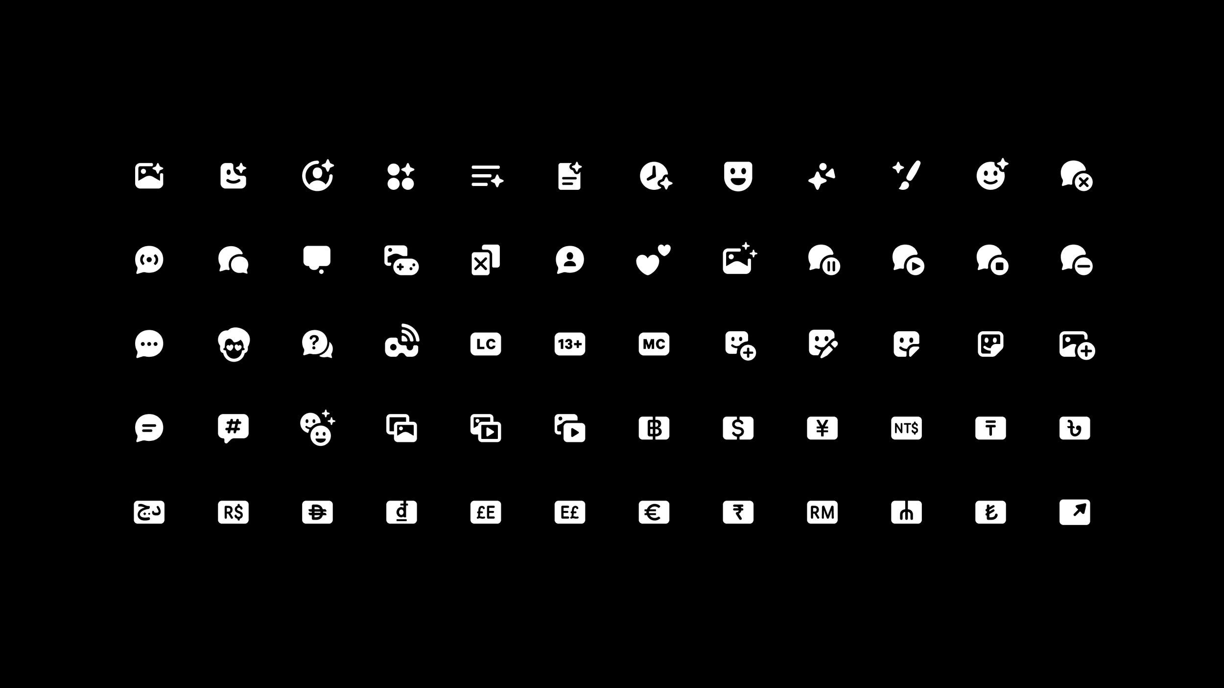
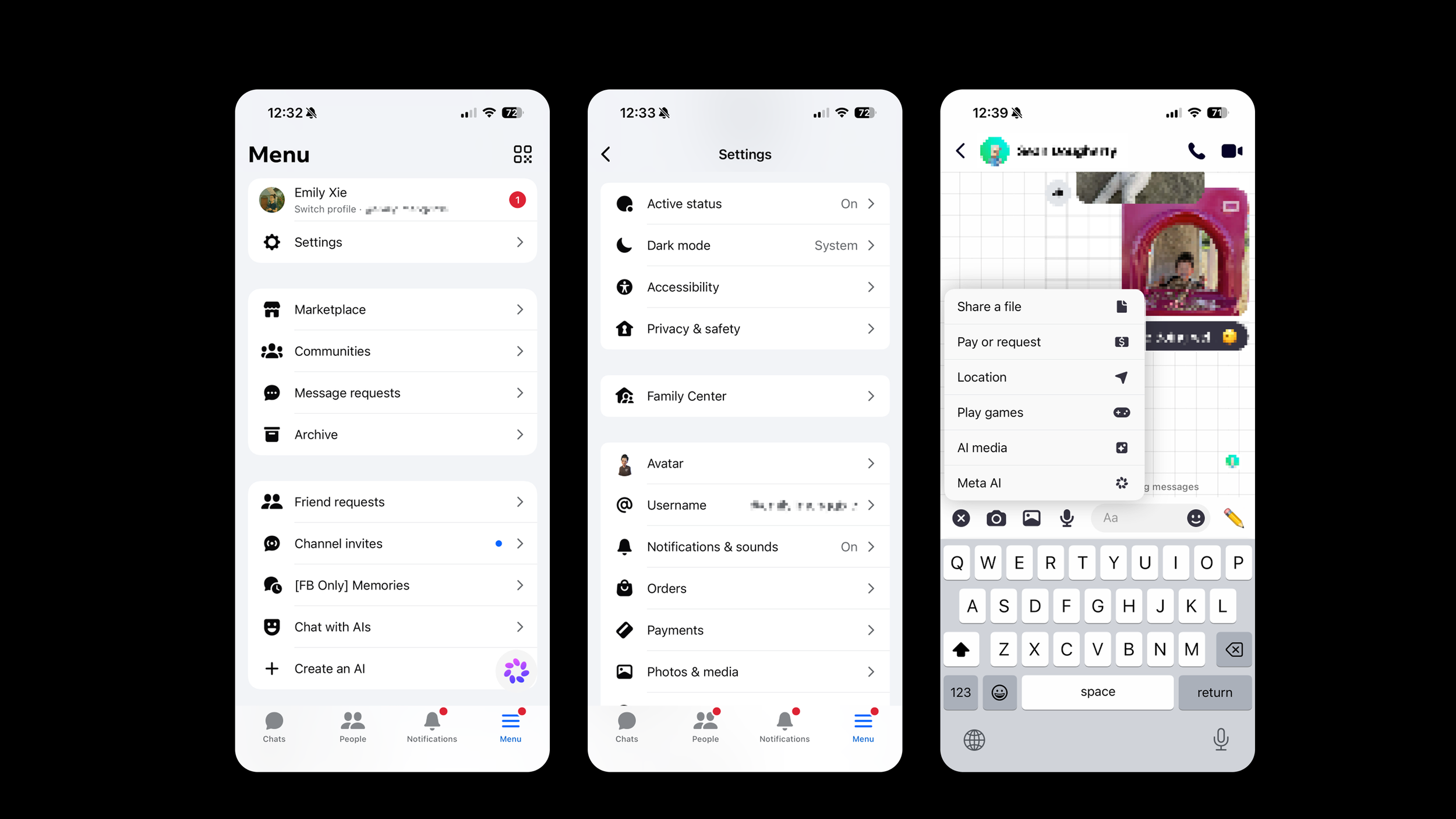
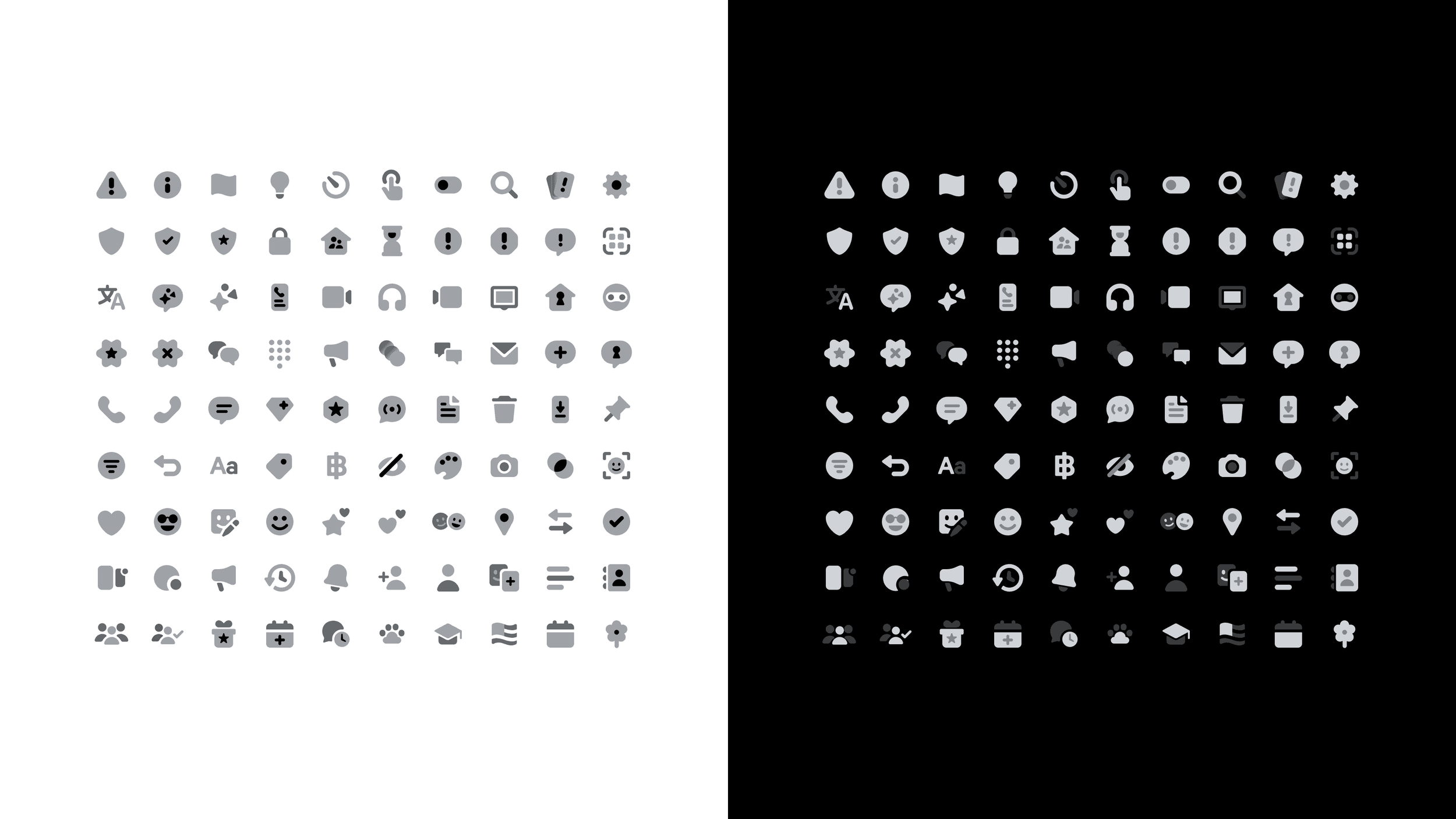
The iconography team designs and maintains a cohesive system of symbolic visuals that communicate actions and concepts across the UI. These icons are crafted to remain consistent, clear, and scalable across every platform and surface.
QPs
Although part of the Messenger illustration system, Quick Promotions (QP) are iconography-based. They are optimized for larger scales, allowing for a higher level of detail than standard UI icons.
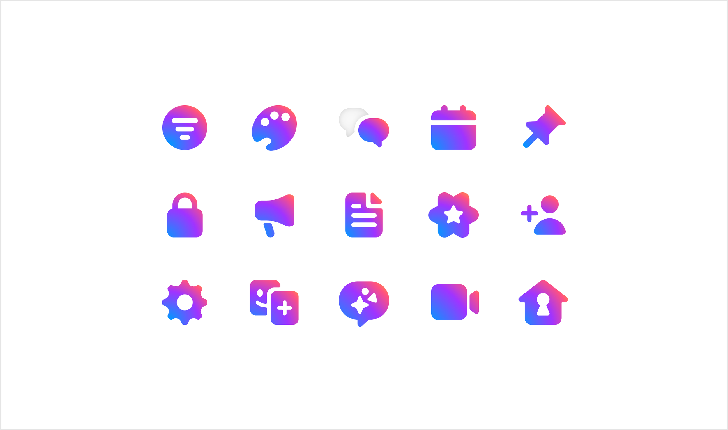
In 2023, Messenger merged back into the main Facebook app, reversing a 2014 separation.
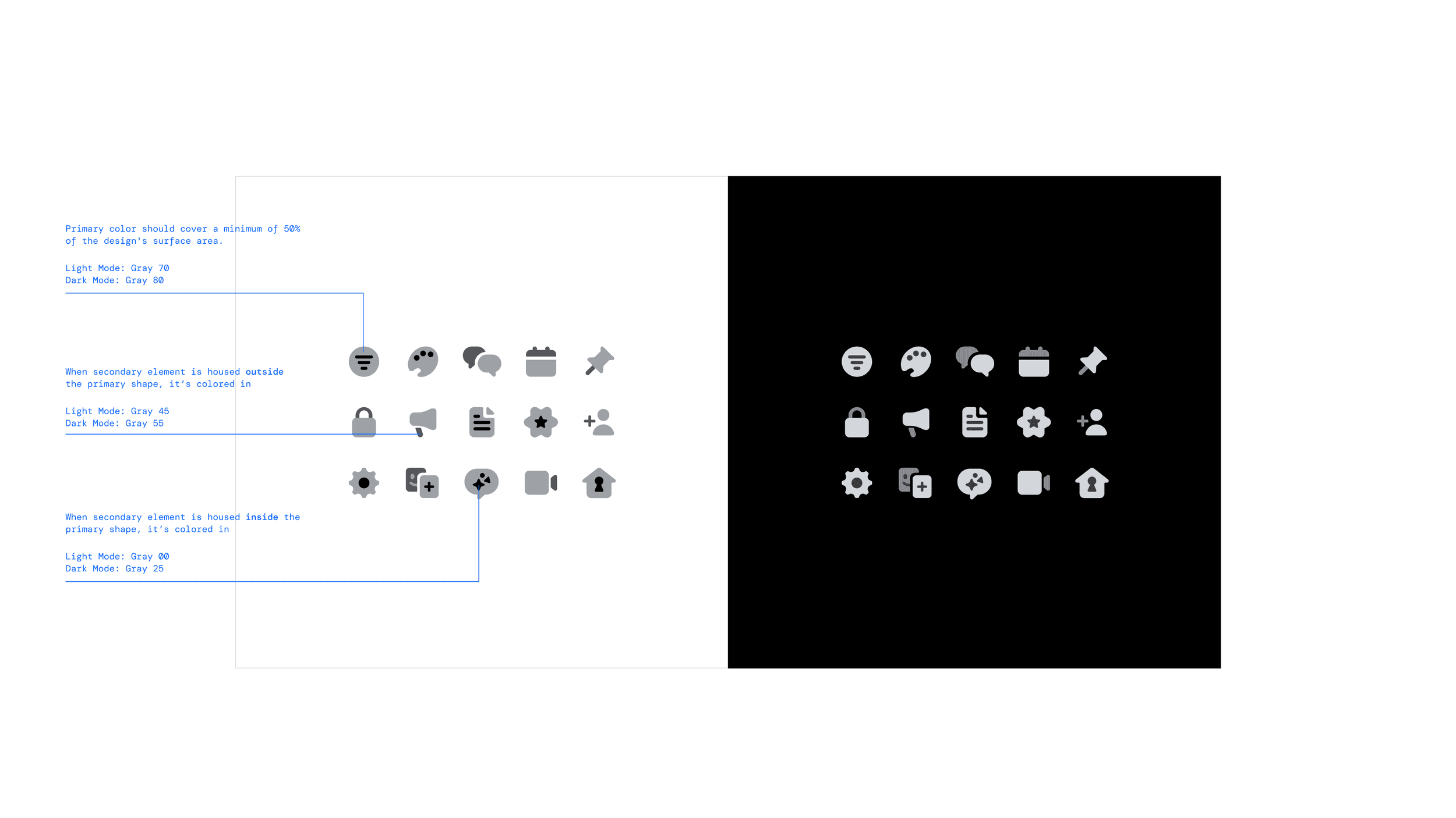
This shift required an immediate pivot for the design system: phasing out Messenger's distinct "Ultraviolet" brand color to ensure visual cohesion within the parent app. To meet strict launch timelines, an accelerated recoloring initiative was executed across the entire iconography system, delivering a streamlined, high-speed solution that successfully bridged the transition.
Case study: AI Consumer icon
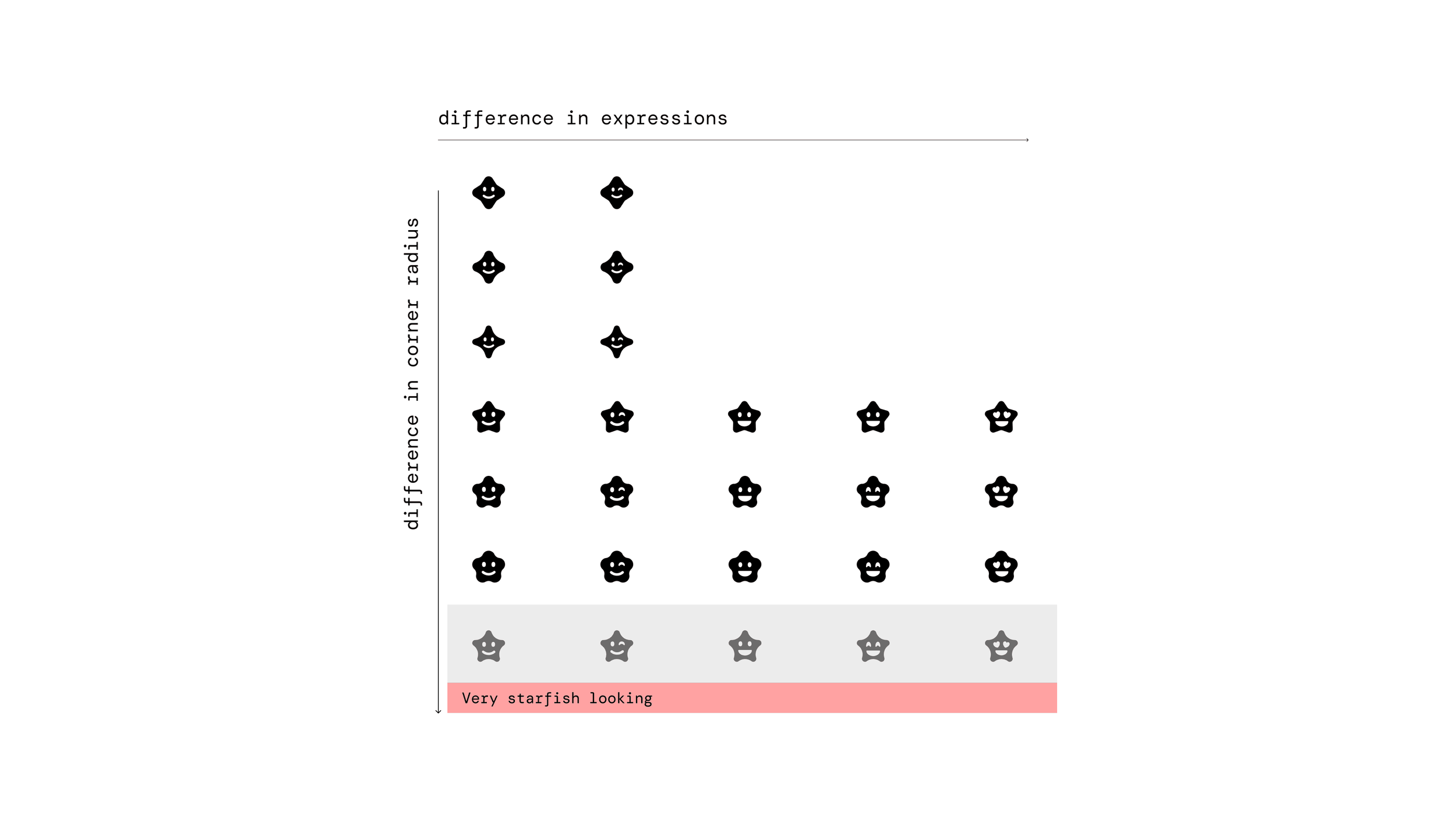
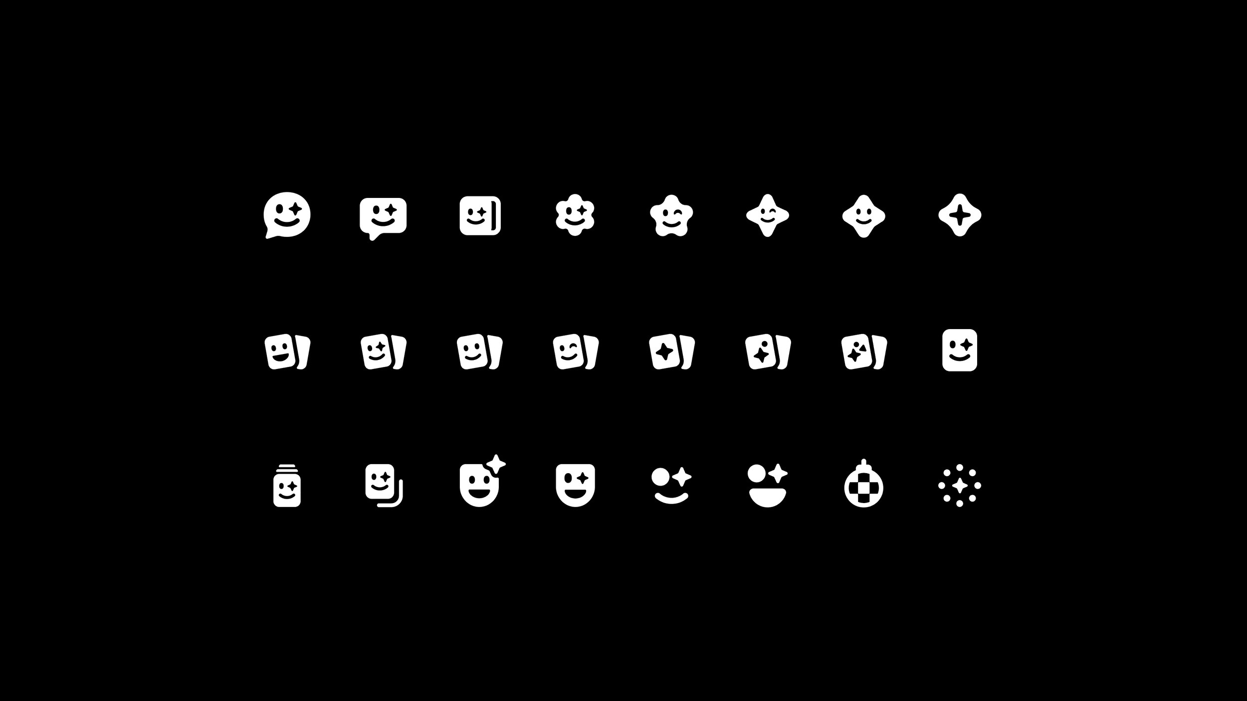
Brief: Define a visual icon to serve as the primary entry point for the Consumer AI tab, facilitating user discovery and interaction with third-party AI integrations.
Role: Led icon design for the Consumer AI entry point, driving multiple rounds of exploration over three months and presenting concepts directly to leadership. Separately contributed to accelerating the Gen AI team's code completion work.
Other projects:
Creative Direction, Art Direction, Strategy
Facebook Illustration System: Caleo

Art Direction, Strategy
Facebook UI Illustration System