Art Direction, Strategy, Design
Messenger Illustration System
-
Messenger's visual moments don't all speak the same language, and they shouldn't. The illustration system was built around three distinct styles, each calibrated for a different context and emotional register: a 3D style for expressive, high-impact moments; a UI style for functional in-product storytelling; and a QP style built for promotional surfaces.
Three styles, one cohesive visual language across Messenger.
-
Owned the Messenger Illustration System end to end, art directing all three styles across the full product. The role grew from hands-on design execution to full creative ownership, eventually absorbing a contractor's workload and becoming the primary creative voice across 30+ cross-functional teams.
Directed two contractors throughout, providing consistent art direction feedback that kept quality high across a high volume of concurrent projects. Built strong cross-functional relationships by bringing teams in early, from kickoff through delivery, and maintaining clarity on every design decision along the way.
Extended the system beyond Messenger, leading its expansion onto Facebook and establishing visual consistency across both platforms.
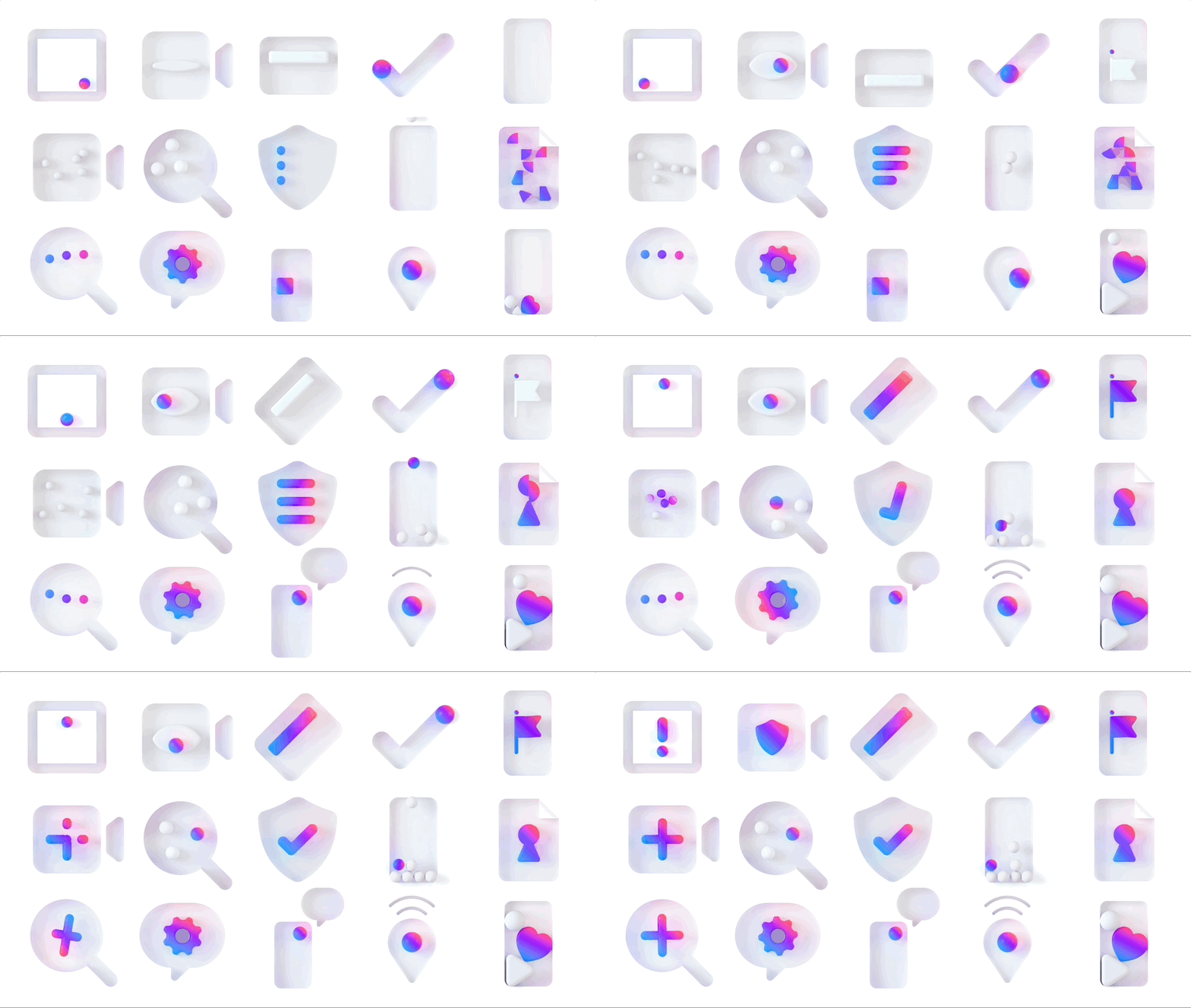
In 2021, following the launch of Chroma, Messenger's new illustration system, the work shifted from introducing a concept to making it real. The challenge was moving Chroma from a promising new direction into a functional, scalable design language built to sustain itself across the product.
Every form is derived from our product principles and playfully recontextualized to best serve its illustrative purpose.
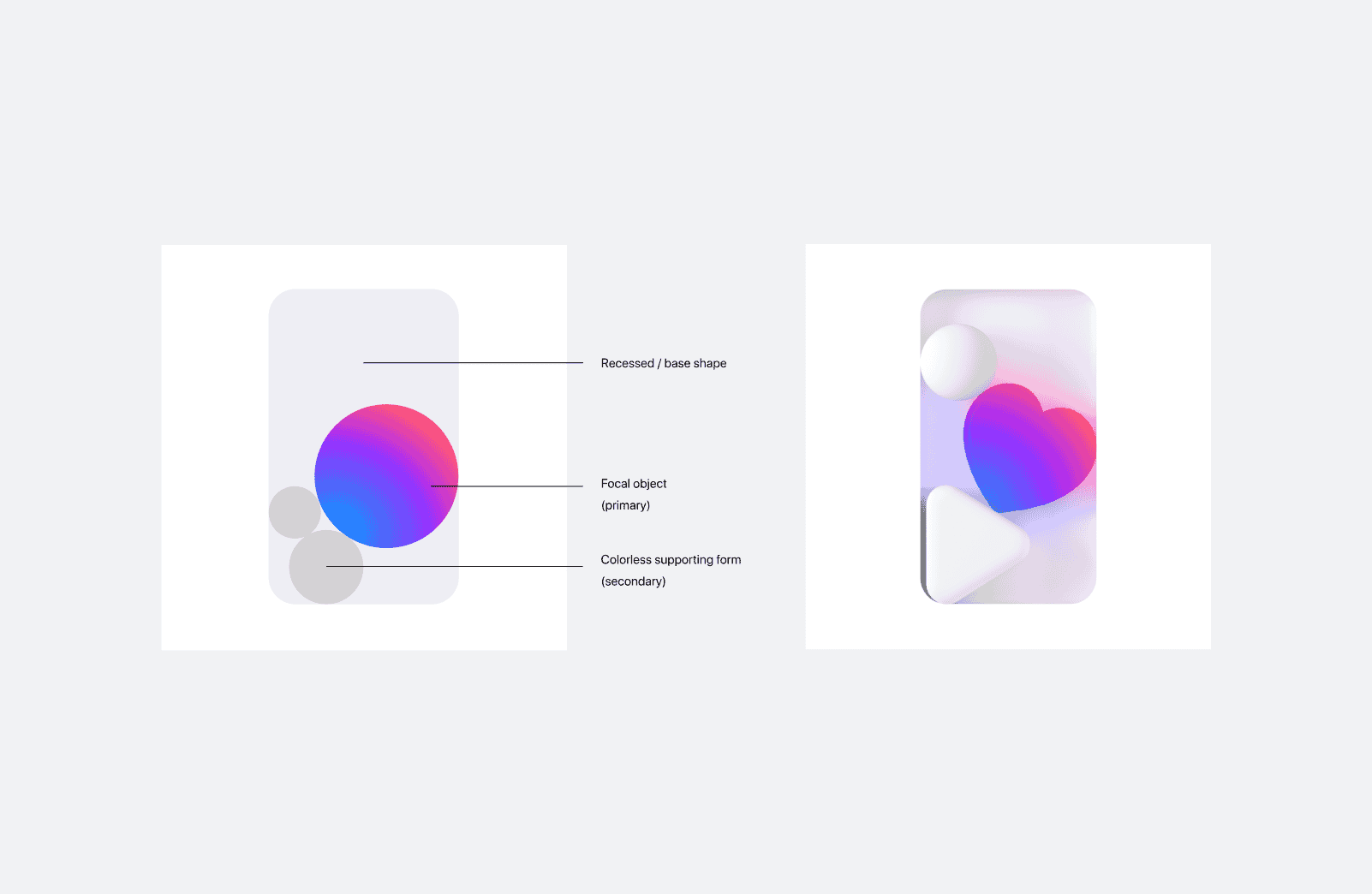
Ultraviolet is Messenger's hero color, anchoring both large and small format illustrations across the system.
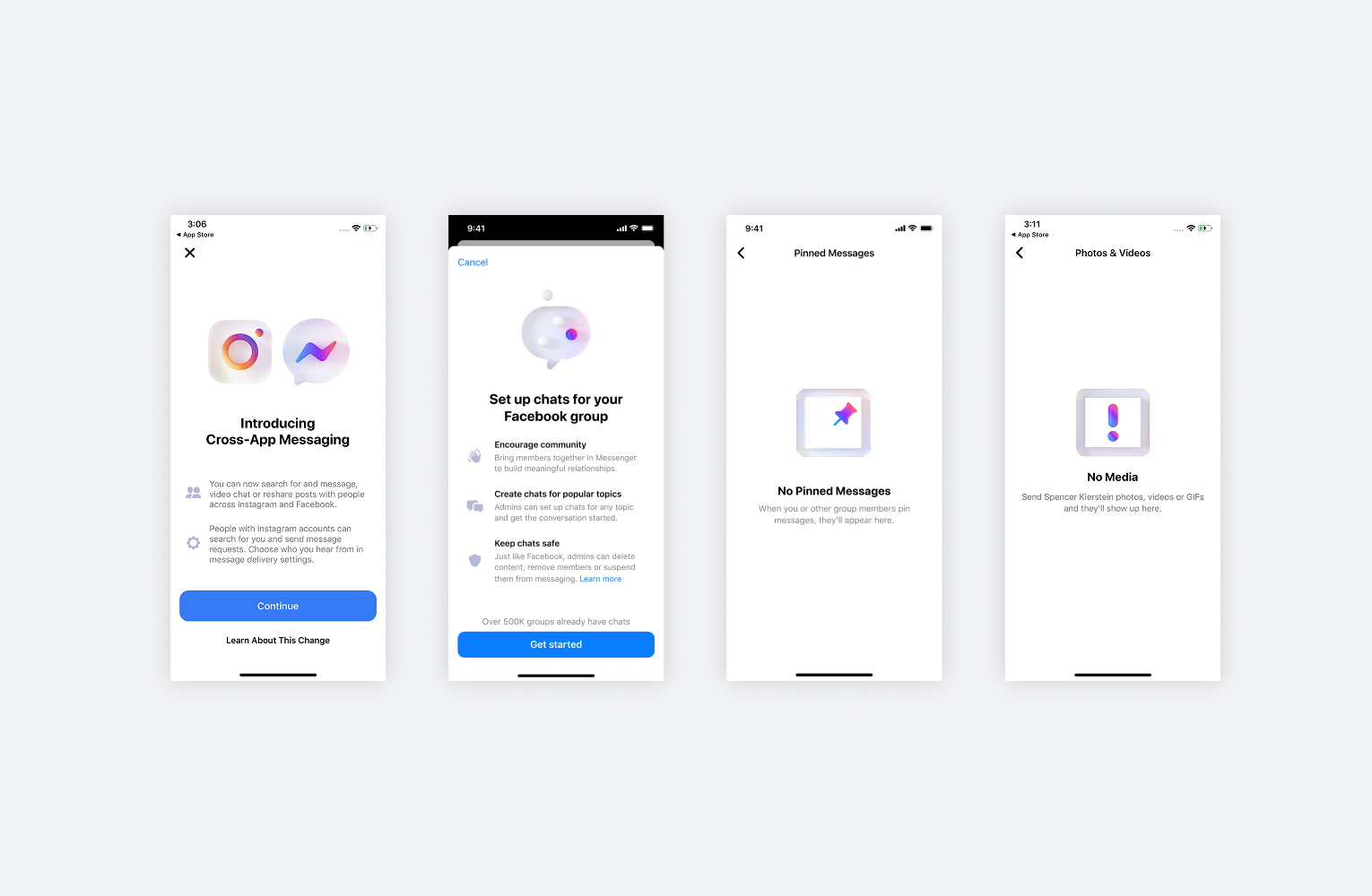
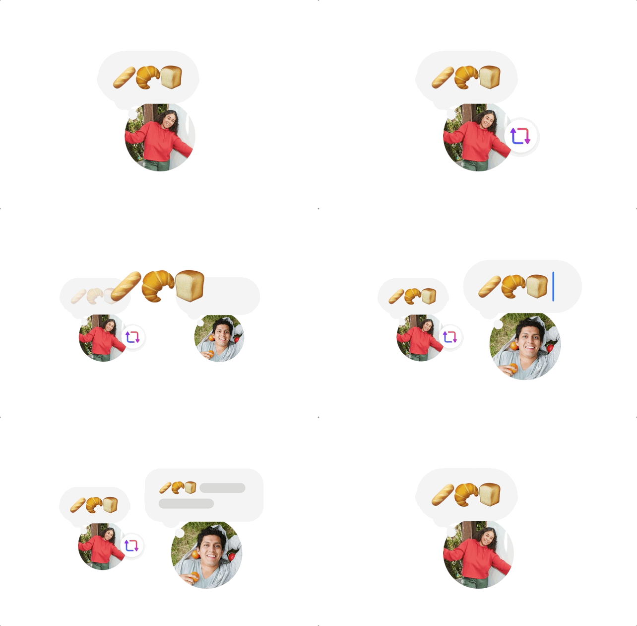
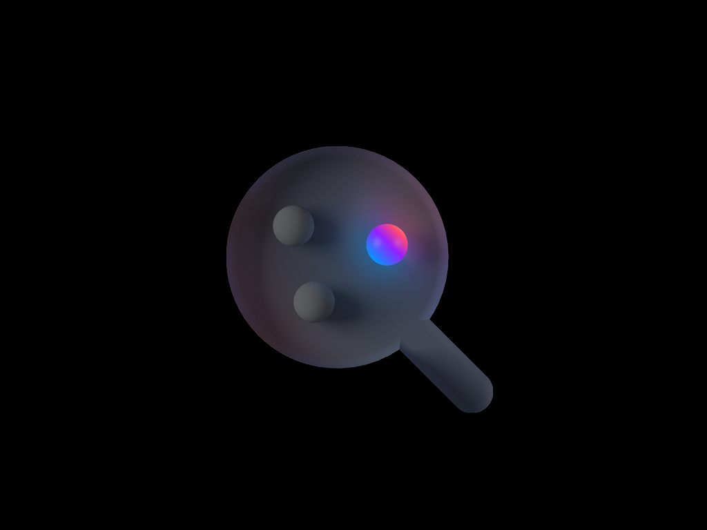
Large format 3D illustrations are built for delight. Paired with content throughout the app, they help users understand something in a moment that feels expressive rather than instructional.
The 3D style is iconography-based, strengthening brand association with familiar experiences. Used when cognitive load is low, it communicates existing features through visuals that feel native to the product.

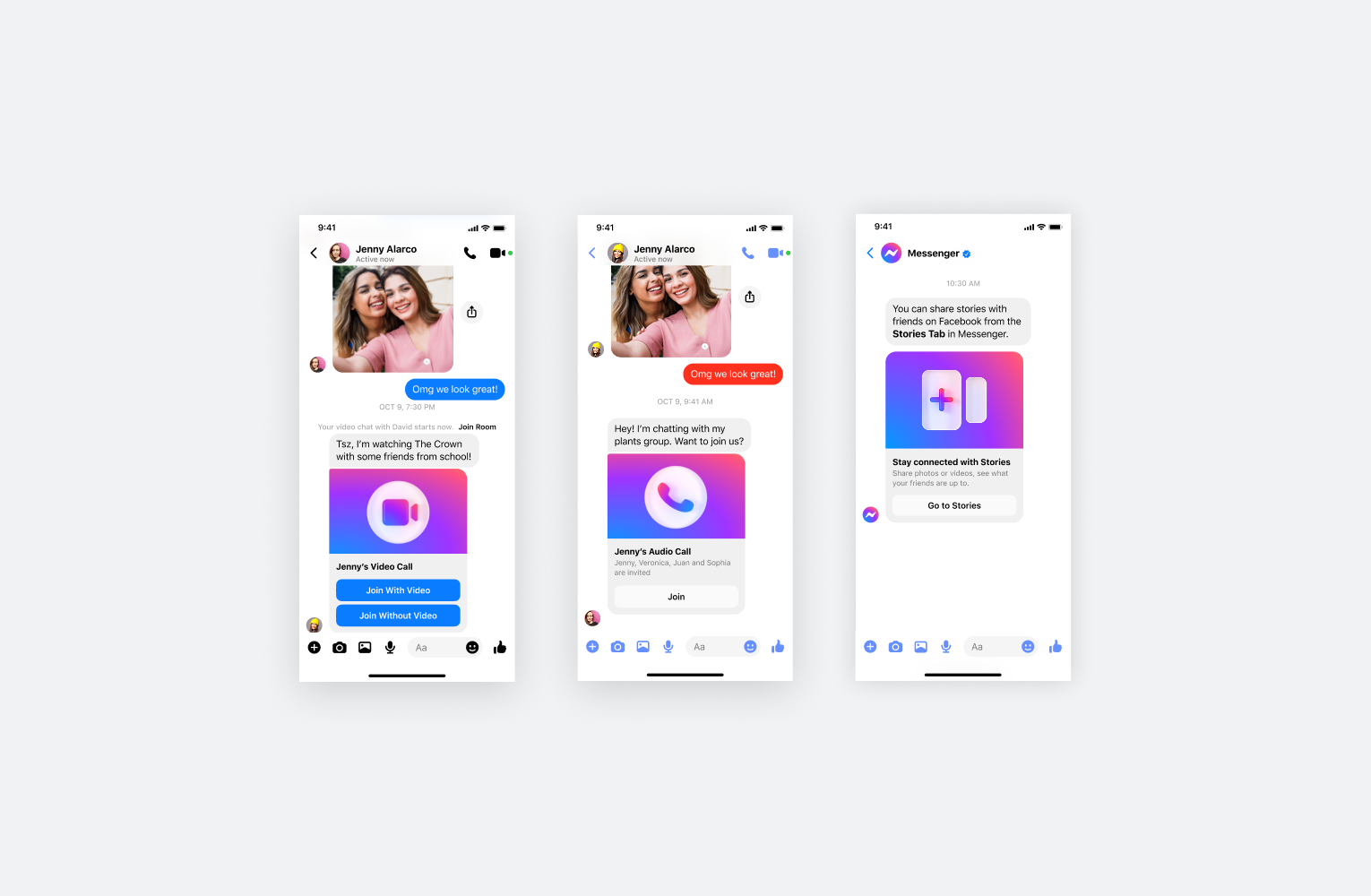
UI illustrations aids comprehension and learning.
Used when introducing new or unfamiliar experiences, they make concrete concepts easier to grasp and reduce cognitive load at the moments that matter most, like guiding users to a feature or showing them how to use it.



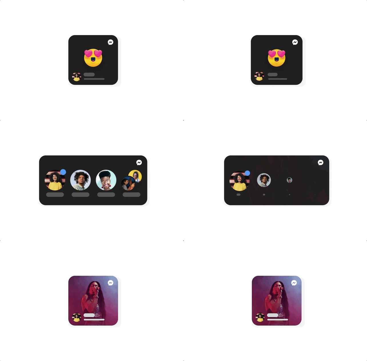
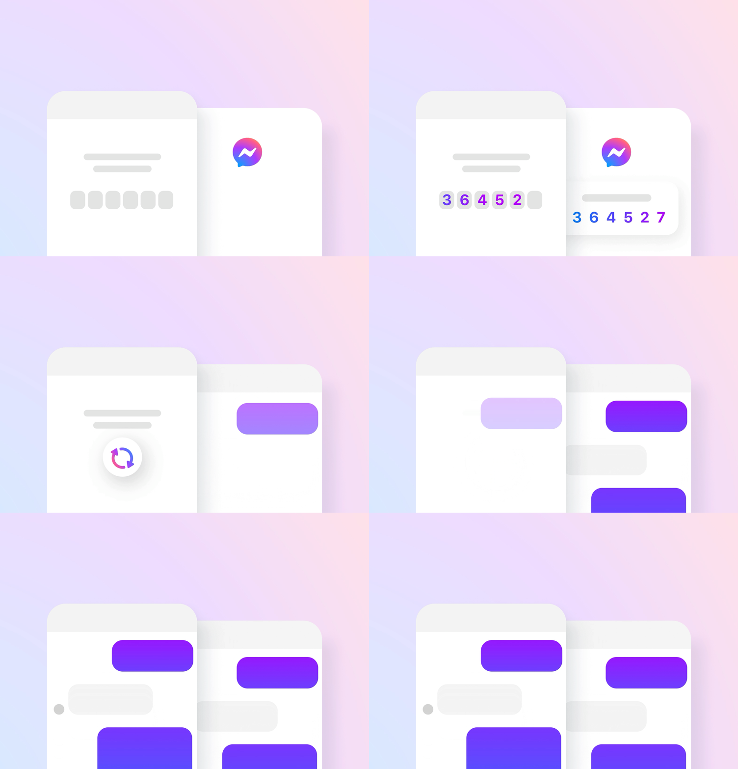
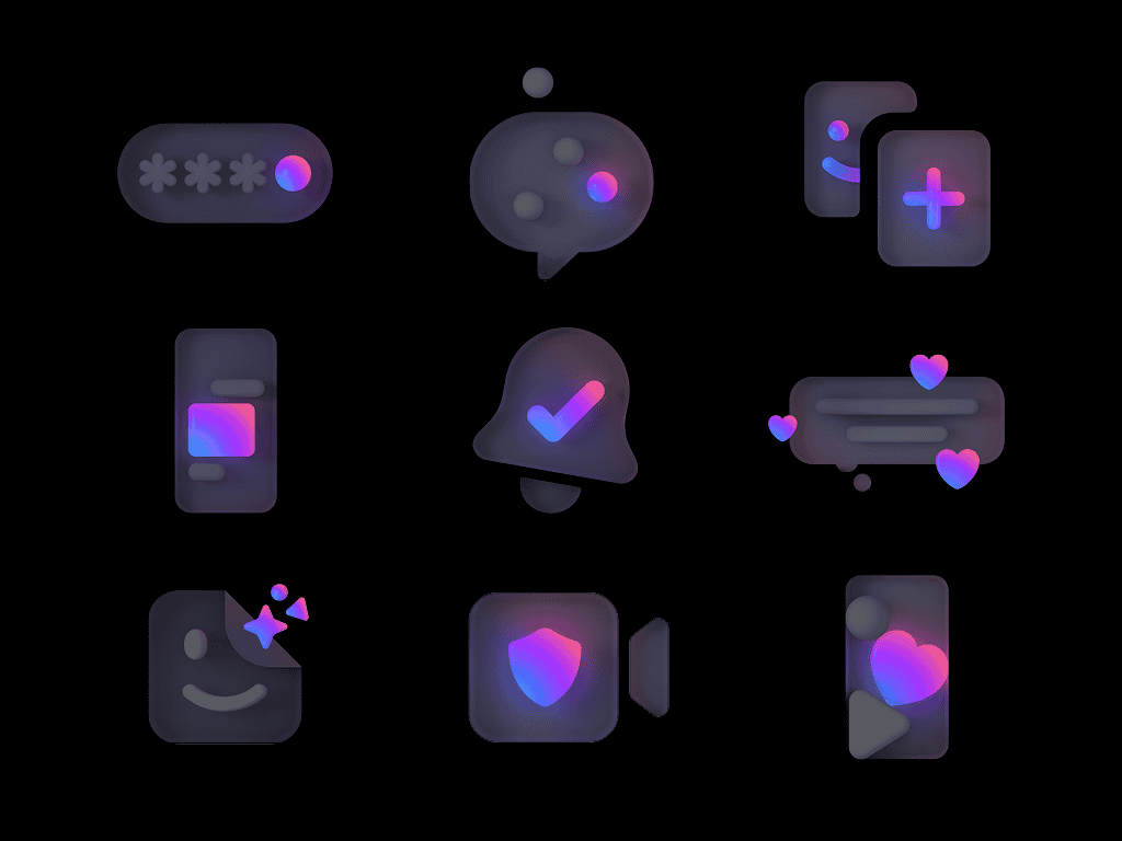
Small format illustrations serve Quick Promotions. Designed to work interchangeably across light and dark mode, a single asset carries full range without needing a separate treatment for each context.
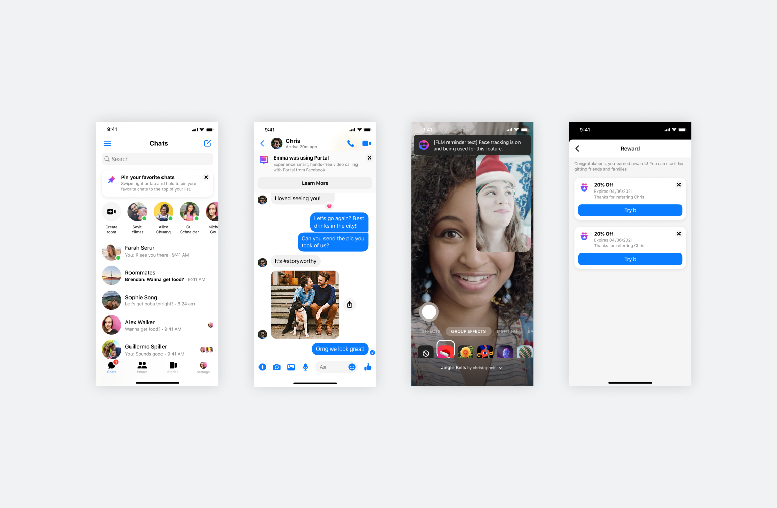
A scalable system
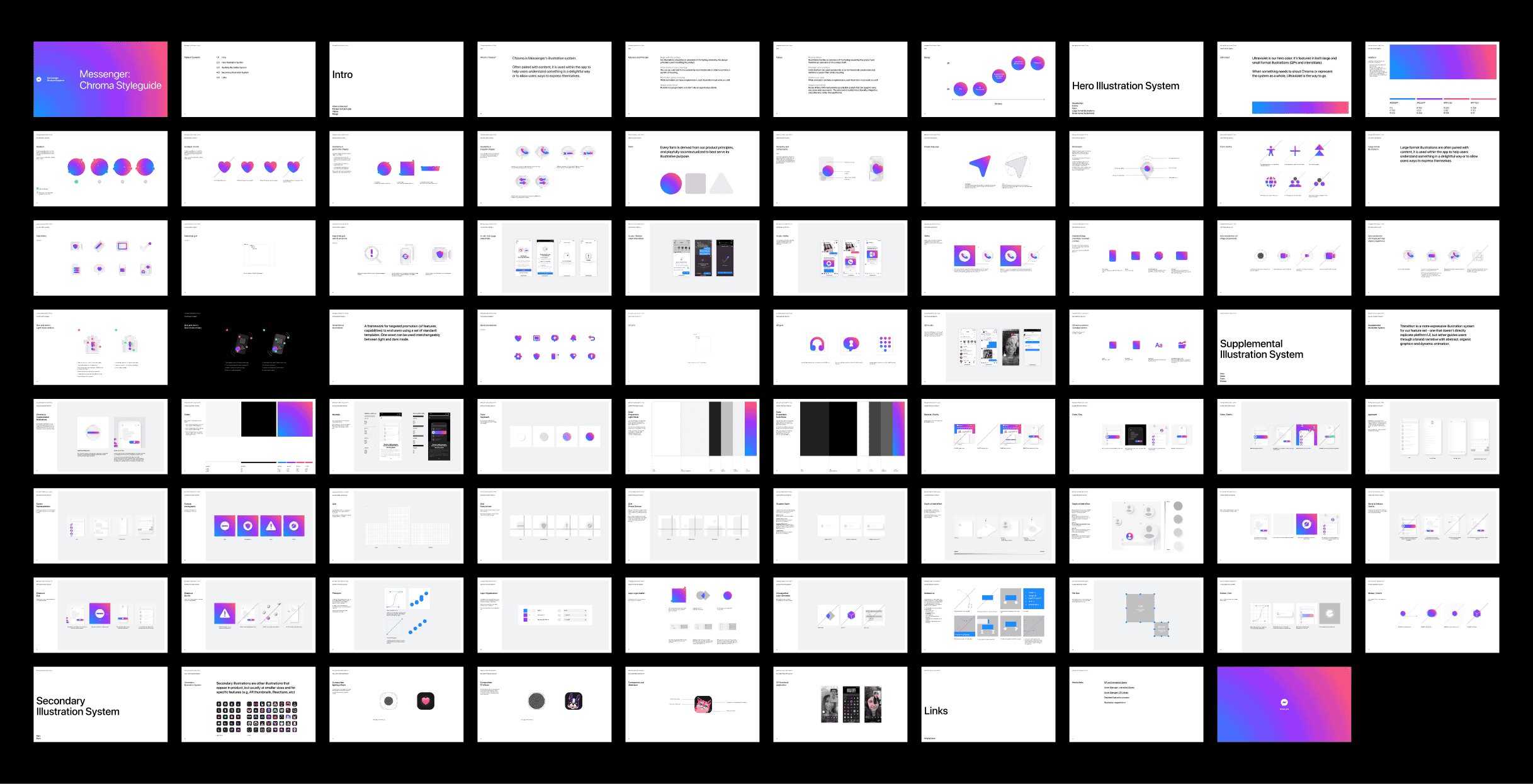
The visual language was built to grow with the product. A modular approach meant new illustrations could be created without starting from scratch, staying on-brand across every surface without requiring a redesign each time.
In 2023, Messenger merged back into the main Facebook app, reversing a 2014 separation.
The rebrand required an immediate pivot: phasing out Messenger's signature Ultraviolet in favor of visual cohesion with the parent brand.
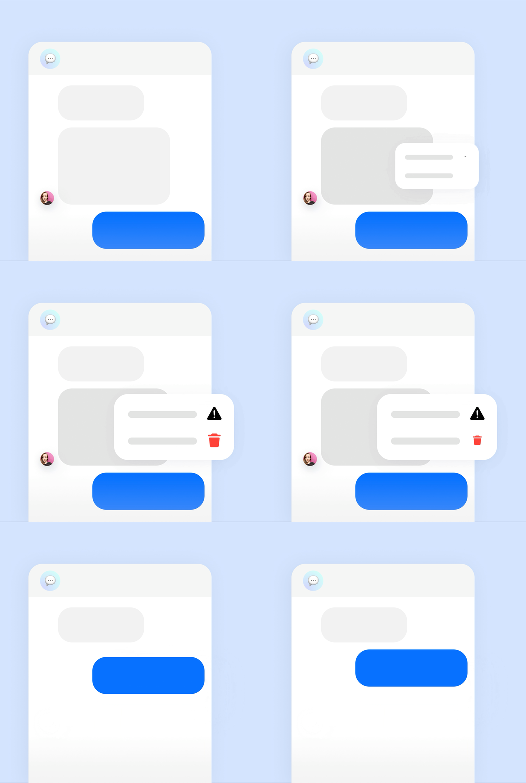
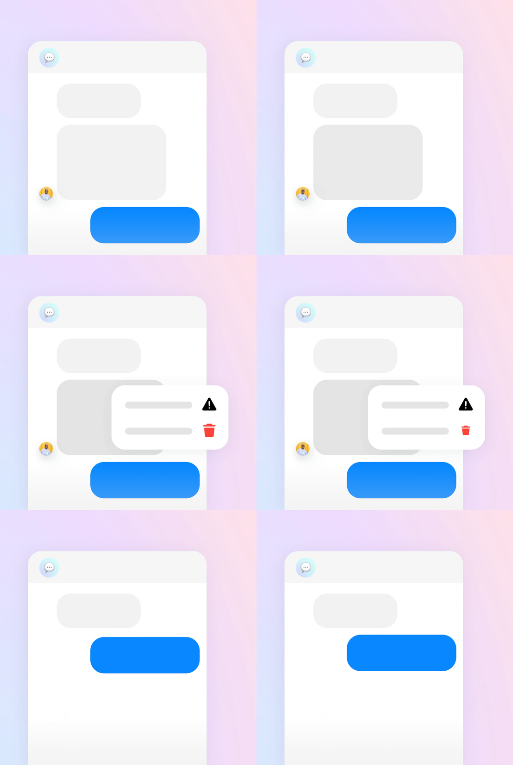
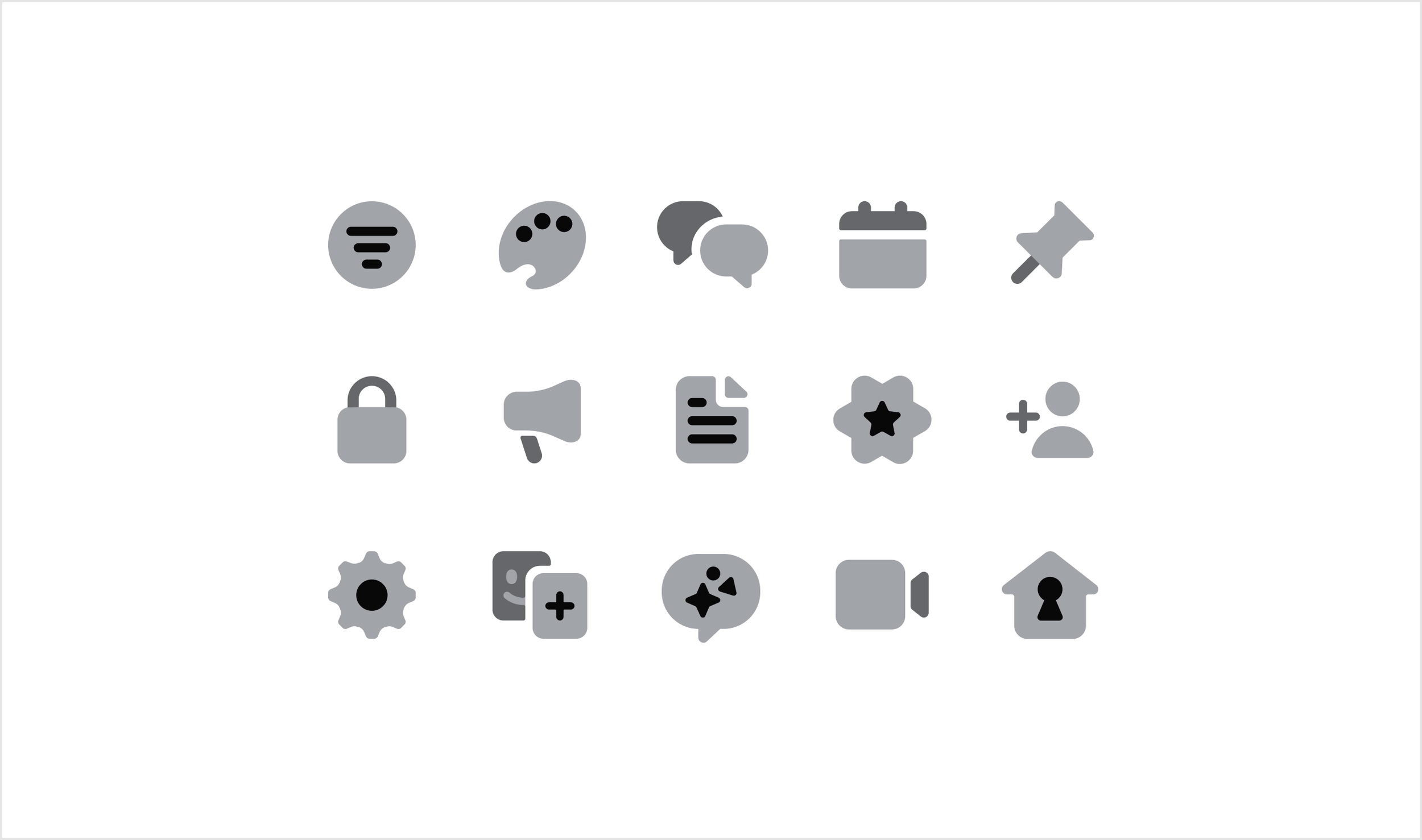
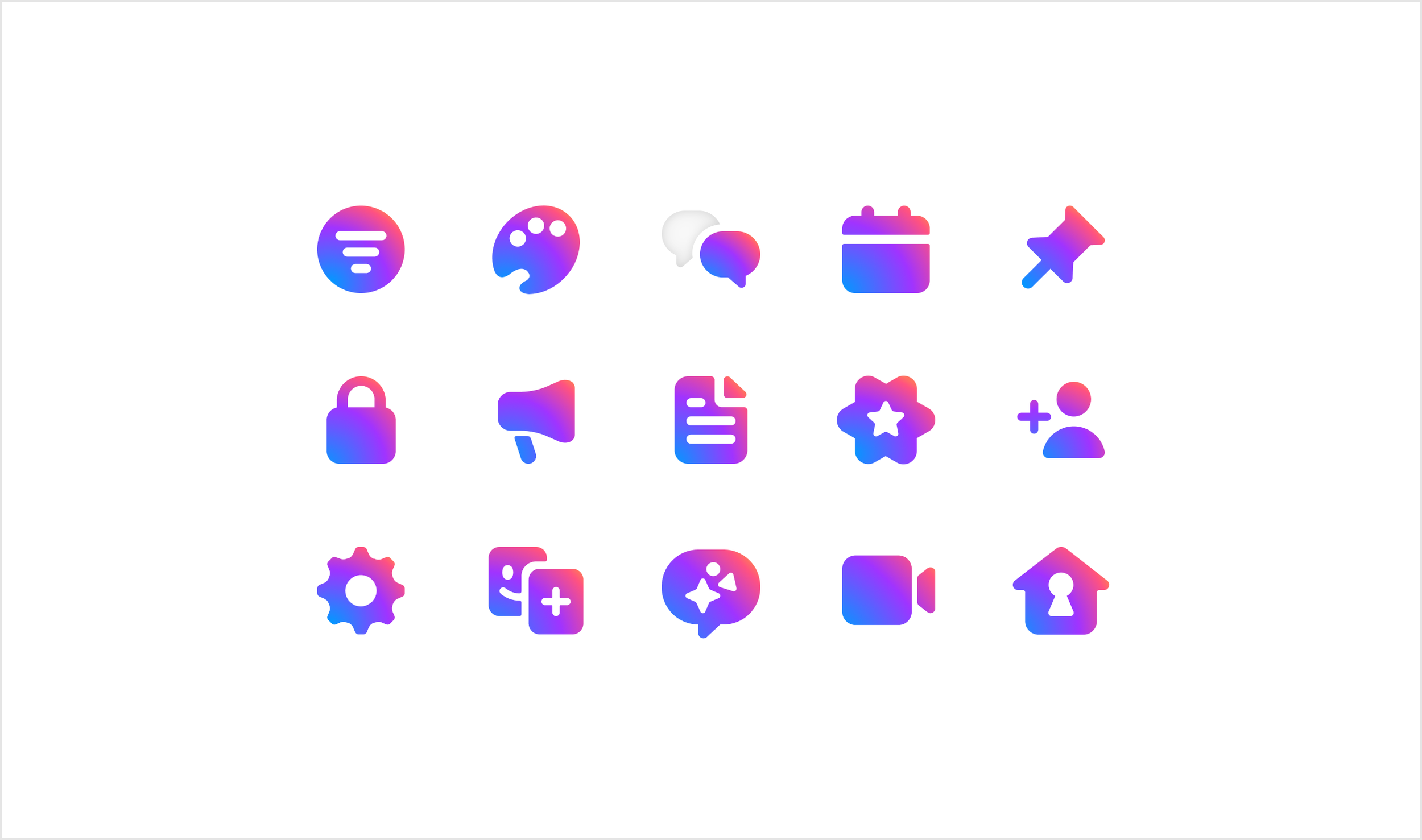
With a hard launch deadline, owned the full recoloring of the illustration and iconography system, moving fast without losing quality. Every asset was updated in time to ship.
Before
After

After
Before
After
Before
Other projects:
Creative Direction, Art Direction, Strategy
Facebook Illustration System: Caleo

Art Direction, Strategy
Facebook UI Illustration System